by KLI | Aug 13, 2015 | Android, iPhone, mobile, usability, UX, Wearables
by Eugenio Santiago
The Apple Watch, released this past Spring, has caused companies to pay close attention to the quickly evolving wearable space. Consumers are looking to see if there is a tipping point for widespread adoption in the near future and they’re interested in staying ahead of it; preparing apps that are especially suited for Apple Store or Android Wear.
About a month ago I unpacked a lime green Apple Watch, paired it with my iPhone and wore it around town. In true researcher form, I found myself paying close attention to every new feature and announcing to my colleagues which features impressed me, and which failed me.
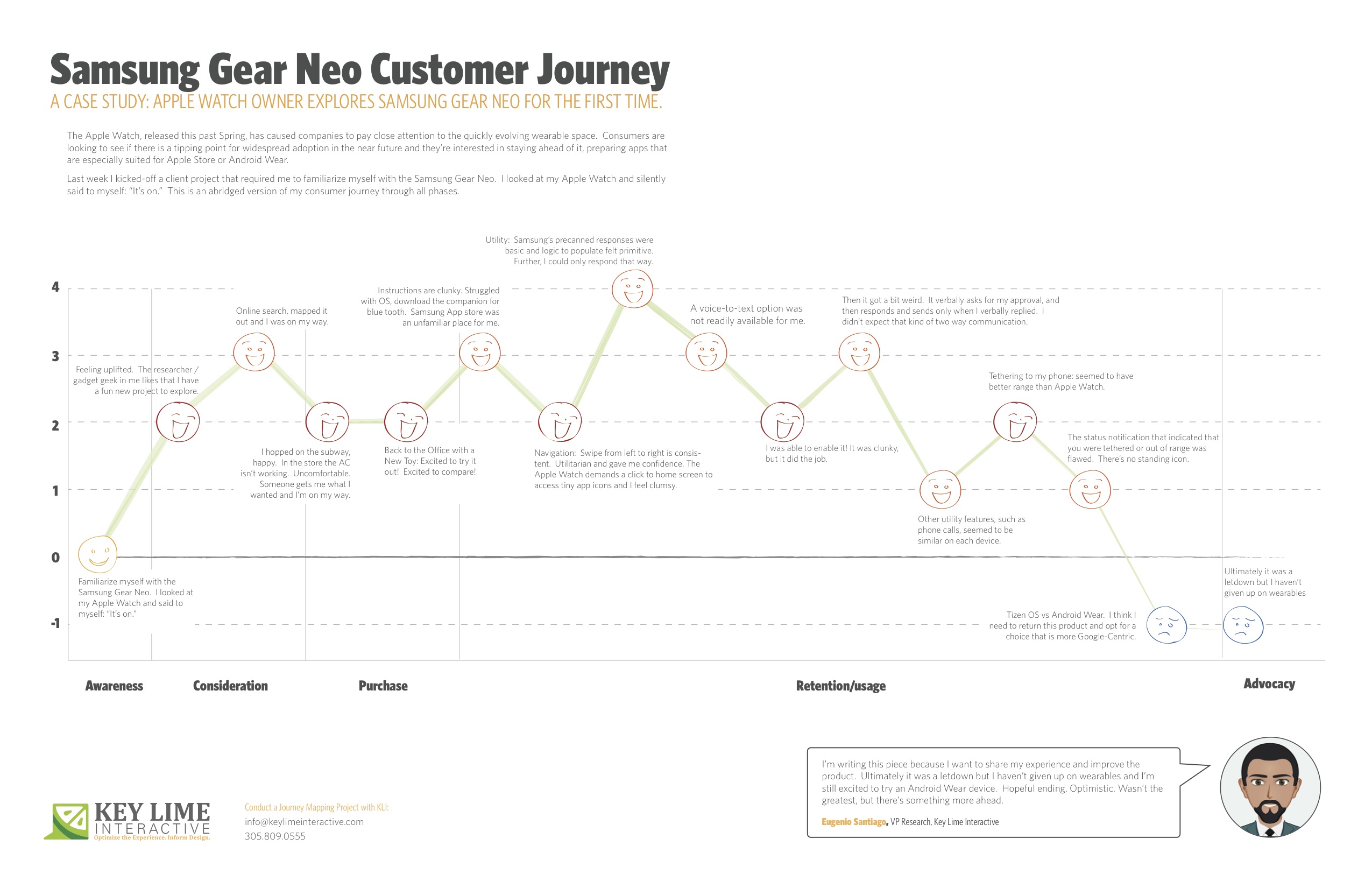
Last week I kicked-off a client project that required me to familiarize myself with the Samsung Gear Neo. I looked at my Apple Watch and silently said to myself: “It’s on.”
I should mention, I’m not an original member of the Apple Fanclub. I stuck to my Samsung Android mobile device for many years as the Apple products evolved. Eventually, I moved to Apple, mostly so that I could keep up on the current offering as much of my project work at KLI demands this. I looked at the Samsung Gear Neo with a wide open mind. I was excited to learn more.
The abridged version of my consumer journey is detailed here, including these typical phases of a consumer journey:
– Awareness
– Consideration
– Purchase
– Retention/Usage
– Advocacy
Awareness:
Last week I kicked-off a client project that required me to familiarize myself with the Samsung Gear Neo. I looked at my Apple Watch and silently said to myself: “It’s on.”
Consideration: Product Research & Purchase
+ 2 Feeling uplifted. The researcher / gadget geek in me likes that I have a fun new project to explore.
+ 1 I took a look on online, CNET.com, the Samsung website, confirmed that particular apps were available and I mapped out the nearest location where these are sold and I was on my way.
Purchase:
– 1 Travel to the store, beautiful outside but quite hot, I hopped on the subway, happy. I walked into the store and the AC wasn’t working, It was stuffy and uncomfortable, overall it sucked. Someone helped me out, got me what I wanted and I was done and on my way.
Back to the Office with a New Toy
+2 Excited to try it out! Excited to compare!
Retention/Usage:
– 1 I open it up and the instructions are clunky. I struggled with the Tizen OS, the pairing options were not straight forward. After re-reading the instructions I recognized that I needed a specific URL to download a companion for blue tooth communication. When I arrived at the Samsung App store, an unfamiliar place for me, I felt I had to fend for myself. No one was waiting to welcome me and show me around, per se.
+ 2 Navigation: Typically, on the mobile experience, you swipe from left to right to move ahead in a variety of different scenarios. On the Samsung Gear, this is consistent. It was intuitive and clear. Utilitarian and gave me confidence in navigating through. The Apple Watch, by comparison, demands that you click to return to the home screen and access app icons in a rhombus shaped cloud, they’re tiny, and I feel clumsy. I liked what I was seeing on the Neo.
Usage:
– 1 Utility: I first took a look at messaging as our first example. Apple executes this well. They have pre-canned text responses that seem to make sense and fit my standard vernacular. They were smart responses to the incoming message. Samsung had this too, but in my anecdotal experience the responses were basic and the associated logic to populate them felt more primitive. Further, I could only respond via precanned text.
– 1 A voice-to-text option was not readily available for me. I eventually found it, after going to my phone to set this up, check through T&C’s, and activating it for use on my watch.
+ 1 I was thankful for that. It was clunky, but it did the job.
-2 Then it got a bit weird. On my Apple Watch I was able to speak my text, review it, and push a button to send the message. On the Samsung I realized that once I was in a scenario where I was using voice-to-text, this was my only option. I’d speak my message, then the system would recognize that I would finish speaking my message and it would cycle through to a screen where I would be prompted to approve of the message. It verbally asks for my approval, and then responds and sends only when I verbally replied. I found it to be a bit uncomfortable that the watch was talking to me during instances when I didn’t expect that kind of two-way communication.
0 Other utility features, such as the acceptance of an incoming phone call, for example, seemed to be similar on each device.
+1 Wearing it for a longer period: Tethering to my phone: I will say that without running a full technical analysis, it seemed to me that the Samsung watch seemed to have better range, so that was a positive.
-1: However, the status notification that indicated that you were tethered or out of range was flawed. Samsung notified me that I was no longer connected, but after that point in time identified no icon or indicator that I was disconnected. If I missed the notification prompt I may not have known that I needed to reconnect or get closer until I actively attempted an activity. Apple has a standing icon.
-2: The Samsung Gear was released in spring 2014. Shortly after the Android Wear release was made for select hardware devices, not including the Neo, it continued to run on the Tizen OS. I think I need to return this product and opt for a choice that is more Google-Centric. I’d liked to have explored a more seamless experience, the “cue card”, full integration with my mail, and more.
Advocacy:
I’m writing this piece because I want to share my experience and improve the product. Ultimately it was a letdown, but I haven’t given up on wearables and I’m still excited to try an Android Wear device. Hopeful ending. Optimistic. Wasn’t the greatest, but there’s something more ahead.
by KLI | May 28, 2015 | App Development, Archived Press Releases, Innovative Thinking, ipad, iPhone, mobile, usability, UX, Wearables
by Kathleen Henning
I received my Apple Watch this past Thursday. I chose the space grey Apple Watch sport with the black band, which was worth the wait. It’s fairly subtle, with one person (okay, a kid!) thinking it could be a real watch. Overall, I am impressed with its performance, especially for a v1 device with limited connectivity options. Powered by my iPhone 6, even on LTE instead of wireless, there is very little lag in most apps. However, the remote app has some issues connecting to iTunes libraries. It’s fantastic as a remote for the Apple TV, but very limited and challenging to sync with my computer’s iTunes library.
Performance at home is fantastic. I was able to leave my phone in my bedroom and wander all over my apartment with the watch. I made calls on it of durations between 30 and 40 minutes with no problems. I will say the speakers could be a bit stronger, though. It’s hard to hear people if they’re speaking quietly, or also on speakerphone. Messages and alerts come through in real-time, though. Pleasantly, if you’re interacting with an app on another device you do not receive an alert on the watch. While this makes sense, it isn’t true for the iPhone/iPad, so it was a great software addition that should come to more devices in the family.
I was deeply impressed with its performance in transit. Using Bluetooth, the watch is still connected to your phone so you can change music or get activity updates while underground with no cell service. Where there is cell service, it will push notifications to you. I was expecting the watch to be fairly useless while traveling, but that is certainly not the case.
It’s useful while at work. Again, the performance over LTE has few noticeable lags for any app, apart from maybe 5-10 seconds sometimes for NYT updates. The calendar alerts are fantastic. They pop up 10 minutes before your meeting and let you scroll through all of the meeting details. There’s even an option to email the meeting creator, which is the only email option I’ve seen on the watch so far. The dictation is good enough that I wish they allowed text responses to emails. It would be a really useful update. My biggest frustration while using it at work was when I went out of range for a meeting in a far conference room. I didn’t bring along my phone because the watch was a great substitute, but it didn’t alert me as I was exiting its range. Some sort of notification would be helpful, as it’s challenging to gauge distances, especially inside buildings.
The messages app is delightful to use. Being able to dictate messages makes it extremely functional. However, the feature could be improved by making it easier to edit these messages. I’ve definitely found myself canceling messages and re-dictating them due to one or two incorrect words in places that would make overall comprehension challenging. I would also like to be able to send the messages without having to touch the watch. There currently isn’t a verbal command that lets you send a message. Despite these usability challenges, I still found myself sending the majority of my text messages this weekend using the watch. It’s the easiest way to send text messages I’ve seen so far, though it would definitely be improved by easier (or any!) editing capabilities and a way to send without touching it.
Email is surprisingly functional on the watch. Initially, I assumed it would be just notifications, but you can scroll through the entire email. Not everything renders on the watch, especially graphics, but you can see the entirety of provided text, which is very useful. My biggest pain point when using the email feature was how difficult it was to delete emails. When I clicked on a notification, I had to scroll through the email to get to the delete option. In your mailbox you can swipe for a trash option, but as a notification that only gives you the option to clear notifications. Being able to delete from the notification without scrolling through the whole thing would be a useful addition.
My largest gripe centers around Apple Pay. Figuring out how to add a card to the watch was NOT intuitive. It kept directing me to my phone, but I assumed it was the regular Passbook section. I tried re-adding my card, but it didn’t let me. I had to Google how to do it to find out it was in the Apple Watch app on my phone. Even then, I had to re-verify my card for the watch by calling my credit card company. When I tried to use it at Whole Foods by tapping the button twice it kept telling me it was ready, but ultimately it was unable to make the payment. Obviously, this was pretty frustrating. I ended up using my phone. Seeing as the watch is likely one of Apple’s best chances at making Apple Pay catch on, it’s a shame this was the least intuitive watch experience I had all weekend. This experience should definitely be improved. The Apple Pay on-boarding would have been easier with a diagram clearly illustrating where to go on the phone. The BEST solution would be letting me choose on the watch whether to add the credit cards from my phone. I don’t see why I need to go through the phone. I’m not sure why it doesn’t work in stores, but that’s definitely a huge issue that needs to get fixed.
The native activity app is interesting. I’ve given it a small amount of information and it’s been making attempts to inspire me to greater efforts. I personally am not a super active person, but what I like about the activity app as it exists currently is that it works with you. It’s not being overly critical or alerting me too frequently, both of which would result in me turning it off. It’s sitting there in the background letting me know when I’ve hit a goal or reminding me when to stand up. I don’t listen to every stand reminder, but I’ve listened to more than I’ve ignored. I’m curious to see if it changes my behavior over time. It’s definitely a much better way to interact with this information than the Health app on the iPhone, which I’ve always found oddly buggy.
Of the 3rd party apps I’ve interacted with so far on the device, I’m most impressed with the New York Times app. They’ve done a wonderful job of creating a new kind of article specifically for the watch. Some articles feature just a headline, some have pictures, and some have 1-2 sentences. It’s a fun surprise to scroll through them a few times a day. I do hope in the future it’s possible to read full shorter articles on the device, but I understand their choice and think it makes a lot of sense for the watch that exists today. 95% of my interaction with the NYT iPhone app is through notifications, so NYT on the watch is an ideal match. Now I actually get more information with the brief articles and images. I prefer the tablet for actual reading, but again I would be interested in having a more email-like experience for the NYT.
While I was initially unimpressed with the battery life, it was fine over the weekend. It does drain my phone battery faster, BUT it means I’m spending significantly less time on my phone so that evens it out for the most part. Like all Apple devices, I would appreciate a longer battery life, but I will say it survives a 12-hour day much better than the iPhone. Having the two devices has made it possible to have weekend days without airplane mode or constant recharging. Speaking of charging, I wish it were possible to wear the watch while charging it. One of the best use cases for me so far has been using the watch to act as an Apple TV remote. I do most of my Apple TV watching at night, so it would be great to be able to plug it in and continue using it. I’m also curious about the watch’s potential as an alarm, given that the taptic feedback might be a more pleasant way to wake up.
At this stage, I would rate the Apple Watch as a ‘nice to have’. If you, like me, own the whole family of devices and upgrade pretty regularly, go for it. It’s an awesome addition to the family, and you’ll find a lot of unexpected uses for it. I think it needs to be able to stand alone, ideally by v2. However, it’s still challenging enough to use that I wouldn’t recommend it to my parents just yet. I do think it will get there, and I will definitely be keeping mine and not returning it. Its best uses for me are: messaging, Apple TV remote, email, and keeping me off my iPhone (supposedly the #1 secret purpose). Those are important enough things in my life that I find value in a device that improves my access to them.
Note to Apple: I would be happy to put a $5 data share plan on it so I could leave my phone behind while at conferences, meetings, bars, parties, etc.
by KLI | Feb 10, 2015 | e-commerce platforms, ipad, iPhone, mobile, usability, UX
by Kathleen Henning
While interviewing participants about online shopping habits, regardless of the product, the same issues appear:
- I don’t know if it’s true to size
- Will this fit?
- Is this item good quality?
- Will it be as pictured?
- What is it made of?
These are the questions that determine whether or not they will make a purchase. Many customers, if they do not get satisfactory answers to these questions, will choose to either locate the item in stores or simply purchase something else from a competitor.
When customers are researching products online, they’re trying to understand what the product would look like in person. There are a variety of ways they currently expect companies to help them do this, but their main research method is customer reviews. They’re looking for information about the quality, the fit, the size, the accuracy of the photos, etc. They’re also looking to see if the reviewer is someone like them. In our research, we’ve found that some users really value a reviewer profile with some demographic details (i.e. age, location, style, size, etc.). Users also appreciate retailer efforts to aggregate some of this information, like the size charts Nordstrom and Amazon use.
Recently, retailers have started providing customers with some of this information on their own, like the features and fit. The most critical element of any website trying to sell tangible products is a good zoom feature. If someone is looking to buy clothes, shoes, or furniture, they want to get an up close view. They may want to buy it online, but they’re looking for the feeling of seeing it in person. The more they can see of the item, the more likely they will be to purchase it online. Some websites, like Saks Fifth Avenue and West Elm, have videos of the products available for purchase that show the product ‘in motion’. Customers find this to be very helpful.
When trying to better understand fit, customers are looking to retailers for support. Some users have mentioned that they find it helpful when the site tells them the height of the model and the size he / she is wearing. Others use services like Fit Predictor, available at Saks Fifth Avenue and other department stores. This uses your size in brands you have purchased to determine your size in other brands and different items. The FitPredictor predicts the right size for you based on what size you wear for other brands. For example, if you wear a size 8 jean from The Gap, then the FitPredictor will predict the correct size jean in the brand you’re shopping.
Companies should think about the fundamental product questions their users have when determining which features to include on the product page. Will these features help users make a purchase decision by addressing common issues such as quality, fit, size, color, etc.? While much of the initial decision about an item is visual and focused on whether it fits a shoppers personal style, the final decision is based on whether customers believe they have a full understanding of how that item will fit into their lives.
by KLI | Nov 12, 2014 | Conferences, Cultural Impact, Humor, iPhone, mobile, usability, UX
by Kelly Nercess
Lets face it. We live in a society where the majority of people are glued to their mobile devices. Whether it’s texting a friend, finding an online recipe for dinner, or taking a selfie…everyone, at one point or another, is guilty of being attached to their smartphone.
During the Big Design conference in Dallas this year, I had a chance to attend Pamela Pavliscak’s workshop on “ The Real Mobile Experience”. Aside from her entertaining jokes and quick wit, she gave us a her insights on what people really do on mobile phones and how to design for those activities.
Some quick facts:
– For every baby born, there are five mobile devices activated
– 7 billion mobile phones in the world. 55% of those are smartphones
– Typical mobile users check their phones 150 times a day
– Smartphone owners spend over 2 hours on their phone each day
– 21% of US mobile phone owners go online primarily using their phones and globally that number is even higher
– Out of preference: 50% of smartphone owners under 30 use the Internet primarily on their mobile phone
– Out of necessity: 55% of Americans who make less than $30k/year have no web access at home
– For convenience: 34% use the device simply because it is close at hand
– 29% say that their phone is the first and last thing that they look at everyday
– 44% sleep with their phones (in a very platonic manner)
Based on the data that Pavliscak reported, people show a remarkable dependency on their smartphones. The fact that we now wake up and go sleep with this electronic device by our side can even be intimidating for a spouse. Women were asked if they would rather give up sex or their mobile phone for 1 month. Can you guess the answer? 48% of women said they would rather give up sex, while the other 52% said they would rather do without their mobile phones. Hmm, interesting. Where do you fall on the spectrum?
An experiment was performed where she asked 250 people to “take a look at their phone”. She was requesting the owner to just happily pass their phone over to a perfect stranger. The result:
– A slim amount of people actually handed over their phone
– Some made an excuse not to pass it over
– Some also just instantly put their phone away
– Majority of people would hold the phone out and show it while it was still in their possession
So, what does this mean for society? We are way too overprotective of our phones. It’s as if it was our newborn child.
In addition to our phones providing a channel for enhanced social interactions, they also allow us to also solve problems. Pavliscak reported that 86% of people solve problems with their phones, which includes troubleshooting emergencies. What else do we use our devices for? High on the list is making sure our kids are happy. Only 20% of parents don’t use tablets or phones to keep their children occupied. So next time you are at a restaurant and you see a young child playing Angry Birds as opposed to eating their macaroni and cheese, you can look at them and think “Oh, you’re part of that 80%”.
We all know that we love and adore our phones, but what are we really doing on them? Ms. Pavliska proposed another experiment to research what we are spending our time on when our eyes are glued to that mobile screen. Even though we look at it over 150 times a day, we’re usually using it in three ways:
– 72% of the time we Tap
– 77% of the time we Swipe
– 94% of the time we are Scrolling
People know how to use the zoom button, but surprisingly a lot of us will continue to read the small text as opposed to using the gesture to make it larger. How can we optimize the mobile experience based on this data?
– Take the guesswork out for the user, but give them obvious cues
– Get rid of any needless gestures
– First impressions hold the most value for The Flick (scroll down to the bottom, and then quickly back up to the top)
– Don’t have to many hidden menus for when a user applies the The Washing Machine method (someone who swipes up and down/right and left)
– We go to great lengths to avoid typing, so consider that when designing your mobile site
– Use icons in a way that is consistent with other sites
– Essential content should be on the page or on the top (hamburger menus are iffy)
– Sound cues are a missed opportunity – only 74% of people leave their ringer on
Overall, there is much room for improvement for the user experience of mobile devices. They are attached to their phones almost as if it were another limb. Aside from the great content she was able to share, she had an upbeat and entertaining presentation style that did not go unnoticed by the crowd. If I get the chance to attend another talk by Pamela, I won’t miss the opportunity!
by KLI | Oct 7, 2014 | Archived Press Releases, e-commerce platforms, ipad, iPhone, mobile, mobile banking, Simple Bank, usability
by Kathleen Henning
Last month, Apple released two new iPhones, both of which represent a significant size increase over the last model. The iPhone 6 and the iPhone 6 Plus both come in gold, silver, and space gray models and with capacity of 16 GB, 64 GB, or 128 GB. Apple has improved the camera on both models, though only the 6 Plus has optical image stabilization. Battery life is increased on both, but the 6 Plus offers nearly double the battery life for calls.
I received mine in the mail on release day, and it’s been more of an adjustment than I would have expected. The size is still startling at times, though I opted for the ‘smaller’ 6. The power button has been moved to the side, a big departure from its location on all previous iPods, iPhones, and iPads. Hitting power on the side is still not a natural maneuver, though I now sometimes find myself trying to do it on my iPad. The expanded screen size is more significant than would be immediately apparent. Mobile web browsing is smoother, and it is much easier to read email attachments like PowerPoint and Excel files.
The more rounded shape of the phone is striking, but it’s surprisingly slippery in your hand. Carrying it around with you is somewhat of a challenge, as neither the 6 nor 6 Plus fits in the same places the iPhone 5(S) would have. I found myself purchasing a new small bag so it would fit, since it is definitely not a phone I can keep in my pocket! While I enjoy the new screen for browsing, I sometimes find myself missing the manageable size of the 5S I had before. I had contemplated purchasing a 6 Plus, but I’m very relieved I decided against it.
The new operating system represents another small shift for iOS. Health is now a built-in component, and it’s easy to track your steps. I would enjoy a breakdown by location or time, but I imagine that’s what 3rd party apps are for. Voice and video messages are a neat feature, as is the ability to share your location. All of these features are simple to activate and use, which is a critical part of getting users to adopt them.
With iOS 8, fingerprint banking is starting to look like a possibility. Simple Bank, an online-only bank, has enabled login via fingerprint. As using your fingerprint for ID becomes more normal, it will be interesting to see which companies adopt this model. The fingerprint will be the main ID component of Apple Pay, which should help further normalize the feature.
Apple also introduced the Watch. This will come in two different face sizes and with a variety of different band choices. The feature set is still pretty vague. It will be able to receive and respond to at least some calls, text messages, and emails. It will have access to apps to some degree. The battery life is unknown, as is how much it can do away from an iPhone, which is required for some functionality. What is known is that it will be connected to Apple Pay and have some additional check in abilities, like at airports and hotels. The current launch date is ‘early 2015’ so hopefully as that approaches more details become available.
The big question mark still remaining is Apple Pay. When does it launch? Current rumors have the date as October 20th. How quickly will merchants be added? Will it trickle down to smaller companies and businesses? When will Apple allow 3rd party access to NFC? I’m sure I’m not alone in my curiosity here. Our recent series on mobile payments concluded that while there are some better and some worse options, there isn’t a game changer. This is the first real entrant that has that possibility, so I’m excited to see how this plays out.