by KLI | Sep 3, 2015 | Strategy, usability, UX
By David Hoberman
Ask any UX designer or Human Factors researcher about their most memorable moments planning or running usability tests, and you’ll hear some real eye-openers. From challenging client relations, to logistical nightmares, to balky participants, planning and executing a successful usability study requires attention to detail, a deft personal touch, and a fair bit of improvisation in the face of the unexpected.
As a mid-career UX professional who has worked in the financial, healthcare, and medical device fields, I’m constantly thinking about ways to improve not only the quality and delivery of data from studies, but the overall process of planning and executing studies. While there is no single “right” way, there are certainly practices that can better the chances of a successful study.
Here are some useful pre- and post-study activities gathered from experience in the field. Some suggestions might be old hat to seasoned professionals, but if even one of them helps someone avoid stress, lost data or squandered time, sharing them will have been worth it.
Analyze thyself
It can be difficult for ever-busy UXers to step back and make time for the work necessary to interrogate how studies are planned, executed and reported. Yet, planning a short retrospective at the end of each project can ferret out potential areas for improvement that apply not only to the individual study, but to your UX practice as a whole. The devil is in the details, of course; capturing those findings and translating them into action is the real challenge. Subject your own processes to the analytic eye you would turn to a client’s product. Where can they be streamlined or improved?
Do you feel lucky? Well, do you?
Beyond the obvious calamities like no-show participants, minimizing potential problems in study execution comes from experience and the ability to recognize where problems are most likely to occur. If [BAD THING] happened, this session would be totally hosed. Particularly if you are a freelancer or working solo (hence no backup team), assessing the likelihood and impact of those BAD THINGS drives the planning that reduces the risk they will occur and reduces the severity when they do.
Repeat: Redundancy is good for you
Avoid depending solely on digital copies of critical documents. Make sure those digital copies are already downloaded to your laptop because WiFi is ubiquitous until it isn’t. Don’t assume you’ll have time to find a printer at a new study location. Bring paper copies – in particular, several copies of the protocol and discussion guide – organized and ready for quick retrieval.
Similarly, if you are testing material products and are responsible for transporting them to the site, have a teammate bring extra in case of lost or stolen luggage, or a fatigue-induced failure to pack. Consider whether mailing them in advance, with tracking, is an option.
Setting it up
Market research facilities
- Know the site coordinator.
- Make it crystal clear what front desk staff are responsible for, and assume there will be several shift changes over the day, and that your requirements may not survive the inevitable game of telephone.
- For anything more complex than registering and compensating participants, provide the front desk with a clear step-by-step description of who gets what and when. This is particularly helpful if you have multiple Informed Consent Forms for different participant groups, or situations where some participants might return for follow-up sessions while others won’t.
In the field
- Know your field site. If at all possible, take a walkthrough before your session to familiarize yourself with where things are, and any potential distractions or complications (discovering you’re on a bus route or in a WiFi deadzone, etc.)
- If you’re going to be outside, have a fallback plan for inclement weather or an overly noisy environment.

Overall
- Ensure all devices are fully charged before study start. Always have a backup battery or SD card for any devices you are using.
- Check your recording devices. If you’re at a market research facility, check whether some camera adjustment is necessary for the best possible view of the participant.
- If you are the one with the recording devices or software, ensure you and your team (if you have one) know how they work. Nothing is more frustrating than discovering after the fact that your session audio wasn’t recorded because someone forgot to press a button. Use sticky note prompts if necessary (you laugh, but it works.)
- If you’re a solo practitioner running a study, a Livescribe pen that records audio is a great addition to your note-taking arsenal, because it’s much easier to find a particular sound bite in your notes.
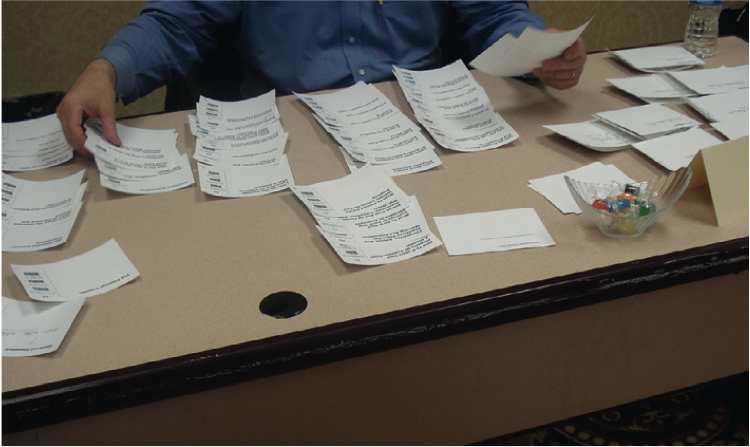
- Mise en place. A French culinary term that means “put in place,” it’s also an extremely useful tactic to minimize scrambling during study execution. Establish specific locations for critical assets and communicate where they are found. At a facility, lay materials out on a table. If you’re on the go, organize your bag so you know where everything is without fumbling around.
- For printed or physical assets, sticky notes make great place labels so your team isn’t forced to rely on memory over a long day. Protocols are here, study guides are there, moderator checklists are over there.
- Separate blank materials from anything participants have filled out.
Breaking it down
Tips for when the study is over:
- If any assets are to be shipped back to clients or the office, have necessary contact and address information ready.
- If you have more than a few items in a box, create a shipping manifesto, and crosscheck before sealing.
- Double-check that any forms or physical media have been collected from site staff, and that any digital media has been transferred to portable form, where applicable.
While some of these activities are more relevant to studies involving physical products, most are broadly applicable to usability studies in general. Whether standardized in checklists or simply incorporated into routine practice, these simple organizational activities can help ensure a resilient and successful study.
by KLI | Sep 1, 2015 | mobile, Uncategorized, usability, UX
by Matt Bruce
In the technologically advanced and incredibly mobilized world we live in today, there’s constant pressure on organizations and businesses to provide customers with a great mobile user experience. According to Google’s Consumer Barometer and the Connected Consumer Survey (2014 / 2015), 57% of the population currently uses a smartphone. Moreover, smartphones play an integral role throughout various phases of product research. Simply put, people are using their smartphones to read about your business and your products, making it imperative that your mobile site be very user-friendly.


Source: Consumer Barometer with Google – The Connected Consumer Survey 2014 / 2015
So, how do businesses ensure that the mobile experience they’re providing their customers with is a great one? Well, that’s a great question, and a great start to answering that question would be to conduct a mobile usability expert review.
At its core, a usability expert review is an actual usability inspection of your site conducted by a usability specialist in order to identify potential usability issues. A usability expert review is one of the most in-demand, cost-effective usability techniques. Expert reviews are a great way to identify glaring usability blunders. They are quick, inexpensive, and provide an immediate sanity check in regards to your user experience.
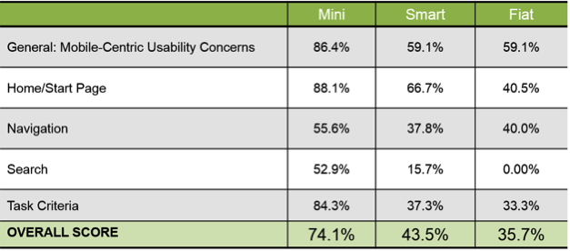
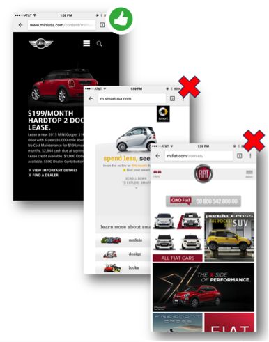
I recently conducted a mobile expert review of three auto manufacturer mobile websites (MiniUSA, SmartUSA, and Fiat) in order to assess their overall user experience and ease of use. I used a handful of usability metrics and assigned scores to each of them in order to determine which mobile site was the most user-friendly. Here are some of the top-level findings and results from my review.
Usability Metrics
- General: Mobile-Centric Usability Concerns – Is the site optimized for mobile?
- Home / Start Page – Are key tasks easy to locate on the home / start page?
- Navigation – Are there convenient and obvious ways to move between pages and sections and is it easy to return to the homepage?
- Search – Is it easy to locate the search box? Can you easily filter/refine search results?
- Task Criteria – Is the info on the site presented in a simple, natural and logical order?

Top-Level Findings
- Location of search icon was quick and intuitive on the MiniUSA site – Quick access to search is a must these days. The MiniUSA site was the clear winner in this respect, as SmartUSA and Fiat failed to provide a search feature on their homepage.

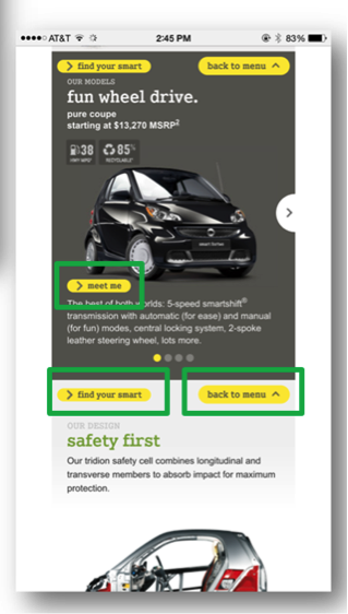
- Uncommon, small CTAs were problematic on the SmartUSA site – Several CTA’s, such as ‘meet me’, ‘back to menu’, and ‘find your smart’, on the SmartUSA site proved to be quite confusing, as it’s not clear where users would be taken if they clicked/tapped on these CTAs. Also, with very precise touch targets, the CTAs were very small and difficult to tap on.

- Homepage on the Fiat site provided minimal direction – It was not intuitive where to begin a search when looking to buy/lease an automobile. Additionally, while the burger menu was easy to see and access, it provided options far too vague for users to know where they needed to go subsequently to continue their search.

Now that I’ve shared a few examples from an expert review of my own, here are some tips for how to conduct an expert review of your own. While conducting an actual usability test of your mobile site is the ideal route, conducting a quick usability review is still a great start!
Tips for Conducting a Mobile Expert Review
- Identify the critical goals and tasks of your mobile site –It is imperative that you identify the primary goal(s) of your site so that you can know what usability issues are wreaking the most havoc on your bottom line. For example, if you are in the clothing business and you have seen a recent decline in online sales of t-shirts, a crippling usability issue may be present that is preventing users from completing the checkout process, hence the decline in sales. In the e-commerce world, shopping cart abandonment is an extremely widespread issue. Therefore, by conducting an expert review you’ll be able to uncover the specific error(s) occurring at major touch points within the checkout process that are impeding your customers from completing their purchase.
- Define your typical users via a customer persona –The majority of web, mobile sites, and applications have typical users who share a relatively familiar set of skills and expertise when it comes to critical tasks. It’s the job of your organization to identify a “Persona”, which is basically a fictional representation of your typical user or customer. Constructing and modifying your mobile site based on your specific customer personas will allow you to custom tailor site attributes such as terminology, information architecture, and navigation schema precisely to the customers that will be interacting with your site most often.
- Don’t just look at your site, go use it! –This is the part of the expert review where the hands-on review takes place. Since you’ve already identified the critical goals and tasks of your site, as well as your customer personas, now you can put yourself in the shoes of your customers and go through those critical tasks yourself. Take the previously identified critical tasks and walk through them one at a time as if you were the customer, all the way down to completing the t-shirt purchase (using the aforementioned clothing business example).
Now that you’re equipped with some tips for how to conduct a great usability expert review, you can grab your smartphone and put this recently acquired knowledge to work. Your managers, business owners, stakeholders, and most importantly your customers, will surely thank you!
by KLI | Sep 1, 2015 | Competitive Benchmark Study, Uncategorized, usability, UX
by Phil McGuinness

Are you a User Experience professional who uses online survey tools to deliver insights? If so, you’re in luck! For the last four years, I’ve been working extensively with various online survey tools to deliver everything from simple one-off consumer surveys, to large scale multinational Competitive Benchmarking tests. Throughout that time, I’ve had endless opportunities to experiment with different design methods and survey tools – and to make mistakes, and learn from them – so that you don’t have to. In this article, I would like to share with you some of the potential pitfalls to designing and programming these studies that you can avoid in your next survey. Proper survey design can save you countless hours of frustration when it comes time to analyze the data and deliver your report.
- Not Scripting to Your Reporting Tool
Sometimes when you script a survey, you want branching pathways for users who are successful or not, so you create multiple paths. For instance, in UserZoom, you can have a “Success Questionnaire” and an “Error Questionnaire” depending on a particular question. If you only want to look at the success group and the failure group individually, that’s a perfectly sound approach. However, if you want to look at any of those answers cumulatively in the results, you’ll now force yourself to manually compile answers to the same question from those two questionnaires. If you do this across multiple tasks and multiple studies, suddenly you’ll find yourself doing busywork that could have been avoided, had you taken some time to assess how these results would look in the reporting tool. If you’re unsure, run a preview or soft launch with yourself as the participant, and see how the data looks. This could save you hours of time when you get to the analysis phase, trust me!
- Not Making the Most of a Tool’s Capabilities
Knowledge of the survey tool you’re using is extremely valuable when scripting. For example, many survey tools allow you to tag your questions with an alphanumeric code, allowing easier identification when you export the results. Taking a moment to label your questions with clear, concise tags will make your analysis phase easier and less prone to errors.
- Script Once, QA Twice (or more!)
Okay, the old adage is measure twice, cut once, but you get the picture. It’s important to lock everything down before you go into field. If you make sure that you have everything you need before gathering results, you avoid common pitfalls like leaving out a key question, or any number of logic issues that could tank a survey. Survey software typically makes it difficult to make script changes once the study has launched, so you could end up throwing away data from days of fielding. That’s why I recommend at least two QA’s, one from the panelist or participant perspective, and one from the client perspective. Ideally this QA will be done by another member of your team, not the person who wrote the script. Experienced survey designers know that it’s easy to develop blind spots for your own script. A proper QA should first take in the participant point of view, making sure the instructions make sense to someone with no knowledge of what is being tested. The second QA should both verify logic and setup, but more importantly, map back the study design to the goals of yourself or your client. This added verification can prevent costly mistakes and time lost when the study goes live.

- The Kitchen Sink
Finally, the kitchen sink. It’s tempting to shove everything you can into a survey – especially when pressure mounts from your client and stakeholders – but remind them that the most elegant surveys avoid unnecessary questions and focus on what is most important. It’s of paramount importance to minimize survey fatigue, a real problem that lowers response rate and quality. A good rule of thumb for the longest surveys is a length of 20-25 minutes maximum, and that’s stretching it. Even at 20 minutes there is a large drop off on quality comments near the end of the survey. You may end up throwing out results that would have been valid in a 15-20 minute survey. Ask yourself, or your client, “Do we want 50 questions of middling to poor data or 35 questions with high quality responses?”
That’s all for now. I hope you’ve found this educational, or at the very least, entertaining! Subscribe to our newsletter for monthly articles and updates.
by KLI | Aug 28, 2015 | Medical, Personas, usability, UX
by Jonathan Knopf

Whether you ask patients, physicians, or administrators, they all have the same overall opinion of the healthcare system. “Its all over the place.” Your typical radiologist and primary care physician likely have complete different workflows, communication channels, and software systems to document a patient’s care and clearly don’t communicate to each other.
Usability in healthcare is unique in that the creation of more usable systems not only saves time and money on development, but it can also save lives! Some of the usability problems apparent in electronic medical records (EMR) and electronic health records (EHR) include: violations of natural dialog, control consistency, effective use of language, effective information presentation, and customization principles, as well as a lack of error prevention, minimization of cognitive load, and feedback.
As both a UX/UI designer of medical software and a recent ACL reconstruction patient, I became aware of several usability challenges that make designing software for EMR/HER software quite complex. In this article, I will detail five challenges that I have observed and some recommendations for ensuring maximum user satisfaction.
- Legacy Software and Software Lifetime
- This is one of the biggest roadblocks to user satisfaction as making UI improvements may ultimately lead to a Frankenstein software appearance; great UI components may stick out like a sore thumb when added to an old product. There is a lot of fear involved in improving the look and feel of medical software, particularly due to the risk of user error involved with unfamiliarity. This fear should not impede the progress of the product. Software suppliers could potentially risk more by not modernizing their software. Prior to rolling out a UI overhaul, make sure your users are on board with your changes. If not, make sure they have the ability to revert to a previous version (ex. “Modern View” vs. “Classic View”).
- Personas, Personas, Personas
- In healthcare, personas are not primarily for patients, but rather for the specific types of health care providers who use software to treat their patients. The differences between how an admin uses EMR software and how a radiologist uses it are drastically different, both in motivators, features needed, and workflow. It is absolutely critical that you focus on identifying each provider’s persona so you can ensure that the software is providing optimal relevance, efficiency, and ease of use for their workflow. With so many abbreviations and acronyms in the medical world, make sure you are using terms that are familiar to all of your personas.
- UI Design Alignment and Customization
- If you manage more than one UI with different features and workflows, you will need to consider the value of customizing vs. standardizing. Standardization is preferred, but maximizing workflow efficiency is likely more important to users than maintaining the same look and feel. Wherever possible, put your designs in front of your various personas and conduct UX research to determine their preferences and needs.
- Intuitiveness and Cognitive Load
- One of the biggest issues with healthcare software comes from a lack of natural intuitiveness in designs and language. Interfaces should be designed to minimize the cognitive workload on users, not rely on them to follow instructions from a manual, which they seldom read. Elements should be positioned where they follow a simple logical order, provide clear feedback regarding next steps, and minimize the number of steps needed to complete an action.
- Error Handling
- A usability concern that appears in every user facing system is its error handling. Make sure that your error messages are placed within the context of the error location, provide visual clues that an error has occurred, and show the user where the error is located. Visual error feedback should be displayed as soon as possible, not after a form has already been submitted. Provide clear and simple instructions as to how the error can be corrected and, where possible, do not allow the user to advance beyond the error point until it has been corrected. Error handling is another important component to put in front of users. Human factors testing can determine if the users see the messages and are able to take the necessary steps to correct them.
Key Lime Interactive is a usability research and augmented staffing agency capable of identifying any usability issues in medical devices and software since 2009. If you are experiencing some of these challenges with your medical device software and need a strategic roadmap for improvement, contact us at info@keylimeinteractive.com.
by KLI | Aug 26, 2015 | remote testing, UX
by Andrew Schall
Understanding how your users think about the organization of content.
If your users can’t find the information that they are seeking, it might as well not be there at all. An intuitive information architecture (IA) is a core part of a user’s experience, but how do you know what would make sense to them?
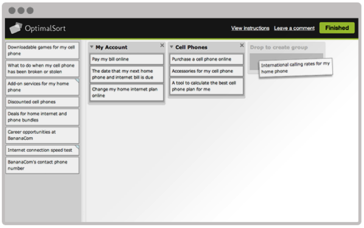
Card sorting is a technique that can help gain insights into how your users think about the organization of your content. This user research method can be performed using an online tool or in-person using physical cards.
The benefits of online card sorting.
Online card sorting has become a very convenient and common way to collect this information from users. The benefits of online card sorting include:
- Fast and easy data collection – participants can log into a website and perform the activity at their convenience.
- Large sample size – it is easy to obtain a large sample size for statistical analysis.

“Image provided by Optimal Workshop (www.optimalworkshop.com/optimalsort)”
Online card sorting has become the predominant way for user researchers to collect this type of data, but it can’t tell you everything you need to know about how to design an intuitive information architecture.
Online card sorting tells you what, but not why.
Collecting data on how your users sort items into categories tells you what they did, but not why they did it. The reality is that designing an information architecture is a messy job, and card sorting can sometimes lead to inconclusive results, especially if the items are particularly challenging for participants to sort.
Qualitative survey questions at the end of an online card are useful, but can’t really help you to get a full understanding of the user’s mental model. There is no way to probe deeper, and participants often give minimal responses to these questions.
Gaining deeper insights with moderated in-person card sorting.
Moderated in-person card sort sessions are typically scheduled for an hour and are conducted one-on-one with a facilitator. Participants are provided with physical materials that include cards labeled with the name of each item to be sorted, pens or markers for making notes, and sometimes color-coded stickers for further annotations.

“Image from chapter 6, Information Architecture & Web Navigation, Eye Tracking in User Experience Design.”
The ability to manipulate physical cards provides many benefits to the participants including:
- Easier to complete – physically sorting cards into groups requires less instruction compared with learning how to use a new online tool.
- More flexibility – participants can put aside cards on a table and spread out as much as they need. They can write on the cards, cross things out, make suggestions, and draw out connections between cards, including cross-linking.
- Higher engagement – participants tend to be more engaged when they are physically moving cards around. They are also less likely to be distracted compared with performing the activity remotely on their own.
The ability to sit with a participant as they sort cards provides many benefits to the researcher including:
- Understand participant’s thought process – think-aloud protocol can be used to have the participant explain why they are sorting cards in a certain way.
- Observe nonverbal responses – do they appear confused or frustrated? Do they visibly hesitate to place a card or create a label for a category?
- Provide motivation – card sorting is a laborious and mentally demanding task. Participants often lose motivation to complete the activity. The facilitator can provide encouragement to the participant to keep going.
Moderated in-person card sorting is more time-consuming both in data collection and analysis than online studies. However, tools are available to reduce the time needed to analyze data.
- Bar code scanner – bar codes can be used to tag each card and can then be scanned into a computer.
- Utilize software tools – the same analysis tools can often be used to analyze the results from an in-person card sort.
Combining the best of both methods.
A hybrid approach that includes online and offline card sort activities will provide a more holistic understanding of how your users envision an information architecture. In this approach, it is recommended to start with an online open card sort study to see general trends in how users sort items. Next, follow up with an in-person study with a smaller sample size to understand a participants’ thought process including insights into how they would use the content.
by KLI | Aug 13, 2015 | Android, iPhone, mobile, usability, UX, Wearables
by Eugenio Santiago
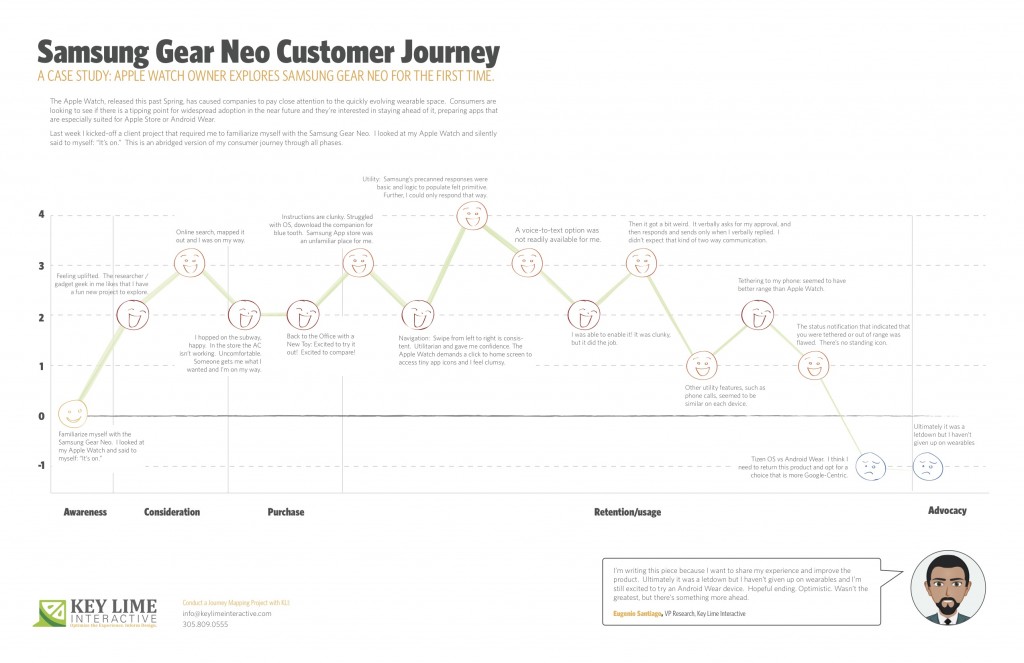
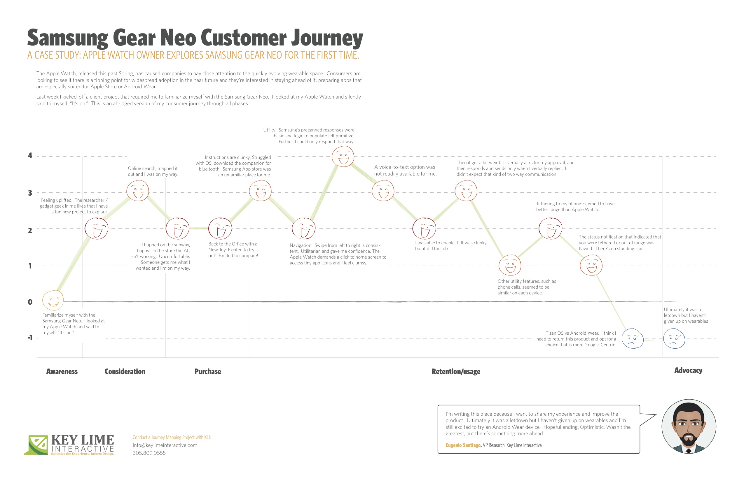
The Apple Watch, released this past Spring, has caused companies to pay close attention to the quickly evolving wearable space. Consumers are looking to see if there is a tipping point for widespread adoption in the near future and they’re interested in staying ahead of it; preparing apps that are especially suited for Apple Store or Android Wear.
About a month ago I unpacked a lime green Apple Watch, paired it with my iPhone and wore it around town. In true researcher form, I found myself paying close attention to every new feature and announcing to my colleagues which features impressed me, and which failed me.
Last week I kicked-off a client project that required me to familiarize myself with the Samsung Gear Neo. I looked at my Apple Watch and silently said to myself: “It’s on.”
I should mention, I’m not an original member of the Apple Fanclub. I stuck to my Samsung Android mobile device for many years as the Apple products evolved. Eventually, I moved to Apple, mostly so that I could keep up on the current offering as much of my project work at KLI demands this. I looked at the Samsung Gear Neo with a wide open mind. I was excited to learn more.
The abridged version of my consumer journey is detailed here, including these typical phases of a consumer journey:
– Awareness
– Consideration
– Purchase
– Retention/Usage
– Advocacy
Awareness:
Last week I kicked-off a client project that required me to familiarize myself with the Samsung Gear Neo. I looked at my Apple Watch and silently said to myself: “It’s on.”
Consideration: Product Research & Purchase
+ 2 Feeling uplifted. The researcher / gadget geek in me likes that I have a fun new project to explore.
+ 1 I took a look on online, CNET.com, the Samsung website, confirmed that particular apps were available and I mapped out the nearest location where these are sold and I was on my way.
Purchase:
– 1 Travel to the store, beautiful outside but quite hot, I hopped on the subway, happy. I walked into the store and the AC wasn’t working, It was stuffy and uncomfortable, overall it sucked. Someone helped me out, got me what I wanted and I was done and on my way.
Back to the Office with a New Toy
+2 Excited to try it out! Excited to compare!
Retention/Usage:
– 1 I open it up and the instructions are clunky. I struggled with the Tizen OS, the pairing options were not straight forward. After re-reading the instructions I recognized that I needed a specific URL to download a companion for blue tooth communication. When I arrived at the Samsung App store, an unfamiliar place for me, I felt I had to fend for myself. No one was waiting to welcome me and show me around, per se.
+ 2 Navigation: Typically, on the mobile experience, you swipe from left to right to move ahead in a variety of different scenarios. On the Samsung Gear, this is consistent. It was intuitive and clear. Utilitarian and gave me confidence in navigating through. The Apple Watch, by comparison, demands that you click to return to the home screen and access app icons in a rhombus shaped cloud, they’re tiny, and I feel clumsy. I liked what I was seeing on the Neo.
Usage:
– 1 Utility: I first took a look at messaging as our first example. Apple executes this well. They have pre-canned text responses that seem to make sense and fit my standard vernacular. They were smart responses to the incoming message. Samsung had this too, but in my anecdotal experience the responses were basic and the associated logic to populate them felt more primitive. Further, I could only respond via precanned text.
– 1 A voice-to-text option was not readily available for me. I eventually found it, after going to my phone to set this up, check through T&C’s, and activating it for use on my watch.
+ 1 I was thankful for that. It was clunky, but it did the job.
-2 Then it got a bit weird. On my Apple Watch I was able to speak my text, review it, and push a button to send the message. On the Samsung I realized that once I was in a scenario where I was using voice-to-text, this was my only option. I’d speak my message, then the system would recognize that I would finish speaking my message and it would cycle through to a screen where I would be prompted to approve of the message. It verbally asks for my approval, and then responds and sends only when I verbally replied. I found it to be a bit uncomfortable that the watch was talking to me during instances when I didn’t expect that kind of two-way communication.
0 Other utility features, such as the acceptance of an incoming phone call, for example, seemed to be similar on each device.
+1 Wearing it for a longer period: Tethering to my phone: I will say that without running a full technical analysis, it seemed to me that the Samsung watch seemed to have better range, so that was a positive.
-1: However, the status notification that indicated that you were tethered or out of range was flawed. Samsung notified me that I was no longer connected, but after that point in time identified no icon or indicator that I was disconnected. If I missed the notification prompt I may not have known that I needed to reconnect or get closer until I actively attempted an activity. Apple has a standing icon.
-2: The Samsung Gear was released in spring 2014. Shortly after the Android Wear release was made for select hardware devices, not including the Neo, it continued to run on the Tizen OS. I think I need to return this product and opt for a choice that is more Google-Centric. I’d liked to have explored a more seamless experience, the “cue card”, full integration with my mail, and more.
Advocacy:
I’m writing this piece because I want to share my experience and improve the product. Ultimately it was a letdown, but I haven’t given up on wearables and I’m still excited to try an Android Wear device. Hopeful ending. Optimistic. Wasn’t the greatest, but there’s something more ahead.