Planning a Better Usability Study
Ask any UX designer or Human Factors researcher about their most memorable moments planning or running usability tests, and you’ll hear some real eye-openers. From challenging client relations, to logistical nightmares, to balky participants, planning and executing a successful usability study requires attention to detail, a deft personal touch, and a fair bit of improvisation in the face of the unexpected.
As a mid-career UX professional who has worked in the financial, healthcare, and medical device fields, I’m constantly thinking about ways to improve not only the quality and delivery of data from studies, but the overall process of planning and executing studies. While there is no single “right” way, there are certainly practices that can better the chances of a successful study.
Here are some useful pre- and post-study activities gathered from experience in the field. Some suggestions might be old hat to seasoned professionals, but if even one of them helps someone avoid stress, lost data or squandered time, sharing them will have been worth it.
Analyze thyself
It can be difficult for ever-busy UXers to step back and make time for the work necessary to interrogate how studies are planned, executed and reported. Yet, planning a short retrospective at the end of each project can ferret out potential areas for improvement that apply not only to the individual study, but to your UX practice as a whole. The devil is in the details, of course; capturing those findings and translating them into action is the real challenge. Subject your own processes to the analytic eye you would turn to a client’s product. Where can they be streamlined or improved?
Do you feel lucky? Well, do you?
Beyond the obvious calamities like no-show participants, minimizing potential problems in study execution comes from experience and the ability to recognize where problems are most likely to occur. If [BAD THING] happened, this session would be totally hosed. Particularly if you are a freelancer or working solo (hence no backup team), assessing the likelihood and impact of those BAD THINGS drives the planning that reduces the risk they will occur and reduces the severity when they do.
Repeat: Redundancy is good for you
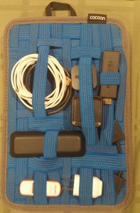
Avoid depending solely on digital copies of critical documents. Make sure those digital copies are already downloaded to your laptop because WiFi is ubiquitous until it isn’t. Don’t assume you’ll have time to find a printer at a new study location. Bring paper copies – in particular, several copies of the protocol and discussion guide – organized and ready for quick retrieval.
Similarly, if you are testing material products and are responsible for transporting them to the site, have a teammate bring extra in case of lost or stolen luggage, or a fatigue-induced failure to pack. Consider whether mailing them in advance, with tracking, is an option.
Setting it up
Market research facilities
- Know the site coordinator.
- Make it crystal clear what front desk staff are responsible for, and assume there will be several shift changes over the day, and that your requirements may not survive the inevitable game of telephone.
- For anything more complex than registering and compensating participants, provide the front desk with a clear step-by-step description of who gets what and when. This is particularly helpful if you have multiple Informed Consent Forms for different participant groups, or situations where some participants might return for follow-up sessions while others won’t.
In the field
- Know your field site. If at all possible, take a walkthrough before your session to familiarize yourself with where things are, and any potential distractions or complications (discovering you’re on a bus route or in a WiFi deadzone, etc.)
- If you’re going to be outside, have a fallback plan for inclement weather or an overly noisy environment.
Overall
- Ensure all devices are fully charged before study start. Always have a backup battery or SD card for any devices you are using.
- Check your recording devices. If you’re at a market research facility, check whether some camera adjustment is necessary for the best possible view of the participant.
- If you are the one with the recording devices or software, ensure you and your team (if you have one) know how they work. Nothing is more frustrating than discovering after the fact that your session audio wasn’t recorded because someone forgot to press a button. Use sticky note prompts if necessary (you laugh, but it works.)
- If you’re a solo practitioner running a study, a Livescribe pen that records audio is a great addition to your note-taking arsenal, because it’s much easier to find a particular sound bite in your notes.
- Mise en place. A French culinary term that means “put in place,” it’s also an extremely useful tactic to minimize scrambling during study execution. Establish specific locations for critical assets and communicate where they are found. At a facility, lay materials out on a table. If you’re on the go, organize your bag so you know where everything is without fumbling around.
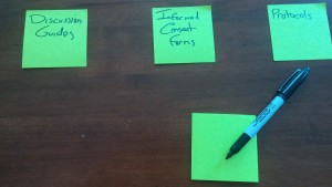
- For printed or physical assets, sticky notes make great place labels so your team isn’t forced to rely on memory over a long day. Protocols are here, study guides are there, moderator checklists are over there.
- Separate blank materials from anything participants have filled out.
Breaking it down
Tips for when the study is over:
- If any assets are to be shipped back to clients or the office, have necessary contact and address information ready.
- If you have more than a few items in a box, create a shipping manifesto, and crosscheck before sealing.
- Double-check that any forms or physical media have been collected from site staff, and that any digital media has been transferred to portable form, where applicable.
While some of these activities are more relevant to studies involving physical products, most are broadly applicable to usability studies in general. Whether standardized in checklists or simply incorporated into routine practice, these simple organizational activities can help ensure a resilient and successful study.
