Watch Techniques to Enhance Your Moderating Skills
Being an effective moderator is one of the most important skills a user experience researcher can master. Being a good moderator is more than reading from a test script, it involves all of the complex social interactions and self-awareness that is a core part of human-to-human interaction. It is extremely easy to impose our views and alter the behavior patterns of a participant. It takes time to perfect moderating skills and requires regular input from even the more experienced researchers. Constructive critiquing is a useful and productive way to get feedback and help to refine those skills.
Trusted by over 130 of the world's top organizations
130+
How to Enhance your Moderating Skills
In this webinar, you will learn the dos and don’ts of moderating qualitative user research sessions. Common mistakes such as leading a participant, questions about when it is and is not ok to interrupt a participant, and how to effectively probe, will be addressed.
This interactive presentation will demonstrate moderating techniques and the five key personas developed by our Principal Researcher that reflect some of the most challenging types of participants to work with. A series of fun and entertaining exercises will help the audience to develop strategies to handle challenging participants. The webinar will also include Q&A time with an opportunity to ask questions from our veteran moderator.
Whether you are a seasoned moderator or a first-timer, this session is for you. Here’s what you’ll get out of this webinar:
A way to self-assess your current moderation skills
Understand five commonly encountered participant personas and how to get the most from these types of individuals
Have a chance to ask a seasoned moderator any tips & tricks
In the technologically advanced and incredibly mobilized world we live in today, there’s constant pressure on organizations and businesses to provide customers with a great mobile user experience. According to Google’s Consumer Barometer and the Connected Consumer Survey (2014 / 2015), 57% of the population currently uses a smartphone. Moreover, smartphones play an integral role throughout various phases of product research. Simply put, people are using their smartphones to read about your business and your products, making it imperative that your mobile site be very user-friendly.
Source: Consumer Barometer with Google – The Connected Consumer Survey 2014 / 2015
So, how do businesses ensure that the mobile experience they’re providing their customers with is a great one? Well, that’s a great question, and a great start to answering that question would be to conduct a mobile usability expert review.
At its core, a usability expert review is an actual usability inspection of your site conducted by a usability specialist in order to identify potential usability issues. A usability expert review is one of the most in-demand, cost-effective usability techniques. Expert reviews are a great way to identify glaring usability blunders. They are quick, inexpensive, and provide an immediate sanity check in regards to your user experience.
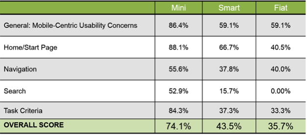
I recently conducted a mobile expert review of three auto manufacturer mobile websites (MiniUSA, SmartUSA, and Fiat) in order to assess their overall user experience and ease of use. I used a handful of usability metrics and assigned scores to each of them in order to determine which mobile site was the most user-friendly. Here are some of the top-level findings and results from my review.
Usability Metrics
General: Mobile-Centric Usability Concerns – Is the site optimized for mobile?
Home / Start Page – Are key tasks easy to locate on the home / start page?
Navigation – Are there convenient and obvious ways to move between pages and sections and is it easy to return to the homepage?
Search – Is it easy to locate the search box? Can you easily filter/refine search results?
Task Criteria – Is the info on the site presented in a simple, natural and logical order?
Top-Level Findings
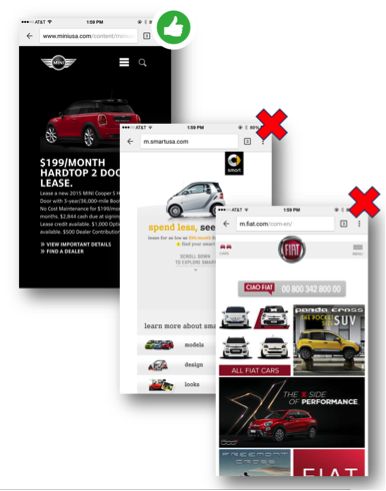
Location of search icon was quick and intuitive on the MiniUSA site – Quick access to search is a must these days. The MiniUSA site was the clear winner in this respect, as SmartUSA and Fiat failed to provide a search feature on their homepage.
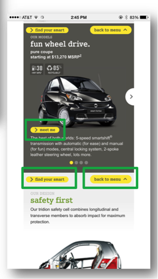
Uncommon, small CTAs were problematic on the SmartUSA site – Several CTA’s, such as ‘meet me’, ‘back to menu’, and ‘find your smart’, on the SmartUSA site proved to be quite confusing, as it’s not clear where users would be taken if they clicked/tapped on these CTAs. Also, with very precise touch targets, the CTAs were very small and difficult to tap on.
Homepage on the Fiat site provided minimal direction – It was not intuitive where to begin a search when looking to buy/lease an automobile. Additionally, while the burger menu was easy to see and access, it provided options far too vague for users to know where they needed to go subsequently to continue their search.
Now that I’ve shared a few examples from an expert review of my own, here are some tips for how to conduct an expert review of your own. While conducting an actual usability test of your mobile site is the ideal route, conducting a quick usability review is still a great start!
Tips for Conducting a Mobile Expert Review
Identify the critical goals and tasks of your mobile site –It is imperative that you identify the primary goal(s) of your site so that you can know what usability issues are wreaking the most havoc on your bottom line. For example, if you are in the clothing business and you have seen a recent decline in online sales of t-shirts, a crippling usability issue may be present that is preventing users from completing the checkout process, hence the decline in sales. In the e-commerce world, shopping cart abandonment is an extremely widespread issue. Therefore, by conducting an expert review you’ll be able to uncover the specific error(s) occurring at major touch points within the checkout process that are impeding your customers from completing their purchase.
Define your typical users via a customer persona –The majority of web, mobile sites, and applications have typical users who share a relatively familiar set of skills and expertise when it comes to critical tasks. It’s the job of your organization to identify a “Persona”, which is basically a fictional representation of your typical user or customer. Constructing and modifying your mobile site based on your specific customer personas will allow you to custom tailor site attributes such as terminology, information architecture, and navigation schema precisely to the customers that will be interacting with your site most often.
Don’t just look at your site, go use it! –This is the part of the expert review where the hands-on review takes place. Since you’ve already identified the critical goals and tasks of your site, as well as your customer personas, now you can put yourself in the shoes of your customers and go through those critical tasks yourself. Take the previously identified critical tasks and walk through them one at a time as if you were the customer, all the way down to completing the t-shirt purchase (using the aforementioned clothing business example).
Now that you’re equipped with some tips for how to conduct a great usability expert review, you can grab your smartphone and put this recently acquired knowledge to work. Your managers, business owners, stakeholders, and most importantly your customers, will surely thank you!
Whether you ask patients, physicians, or administrators, they all have the same overall opinion of the healthcare system. “Its all over the place.” Your typical radiologist and primary care physician likely have complete different workflows, communication channels, and software systems to document a patient’s care and clearly don’t communicate to each other.
Usability in healthcare is unique in that the creation of more usable systems not only saves time and money on development, but it can also save lives! Some of the usability problems apparent in electronic medical records (EMR) and electronic health records (EHR) include: violations of natural dialog, control consistency, effective use of language, effective information presentation, and customization principles, as well as a lack of error prevention, minimization of cognitive load, and feedback.
As both a UX/UI designer of medical software and a recent ACL reconstruction patient, I became aware of several usability challenges that make designing software for EMR/HER software quite complex. In this article, I will detail five challenges that I have observed and some recommendations for ensuring maximum user satisfaction.
Legacy Software and Software Lifetime
This is one of the biggest roadblocks to user satisfaction as making UI improvements may ultimately lead to a Frankenstein software appearance; great UI components may stick out like a sore thumb when added to an old product. There is a lot of fear involved in improving the look and feel of medical software, particularly due to the risk of user error involved with unfamiliarity. This fear should not impede the progress of the product. Software suppliers could potentially risk more by not modernizing their software. Prior to rolling out a UI overhaul, make sure your users are on board with your changes. If not, make sure they have the ability to revert to a previous version (ex. “Modern View” vs. “Classic View”).
Personas, Personas, Personas
In healthcare, personas are not primarily for patients, but rather for the specific types of health care providers who use software to treat their patients. The differences between how an admin uses EMR software and how a radiologist uses it are drastically different, both in motivators, features needed, and workflow. It is absolutely critical that you focus on identifying each provider’s persona so you can ensure that the software is providing optimal relevance, efficiency, and ease of use for their workflow. With so many abbreviations and acronyms in the medical world, make sure you are using terms that are familiar to all of your personas.
UI Design Alignment and Customization
If you manage more than one UI with different features and workflows, you will need to consider the value of customizing vs. standardizing. Standardization is preferred, but maximizing workflow efficiency is likely more important to users than maintaining the same look and feel. Wherever possible, put your designs in front of your various personas and conduct UX research to determine their preferences and needs.
Intuitiveness and Cognitive Load
One of the biggest issues with healthcare software comes from a lack of natural intuitiveness in designs and language. Interfaces should be designed to minimize the cognitive workload on users, not rely on them to follow instructions from a manual, which they seldom read. Elements should be positioned where they follow a simple logical order, provide clear feedback regarding next steps, and minimize the number of steps needed to complete an action.
Error Handling
A usability concern that appears in every user facing system is its error handling. Make sure that your error messages are placed within the context of the error location, provide visual clues that an error has occurred, and show the user where the error is located. Visual error feedback should be displayed as soon as possible, not after a form has already been submitted. Provide clear and simple instructions as to how the error can be corrected and, where possible, do not allow the user to advance beyond the error point until it has been corrected. Error handling is another important component to put in front of users. Human factors testing can determine if the users see the messages and are able to take the necessary steps to correct them.
Key Lime Interactive is a usability research and augmented staffing agency capable of identifying any usability issues in medical devices and software since 2009. If you are experiencing some of these challenges with your medical device software and need a strategic roadmap for improvement, contact us at info@keylimeinteractive.com.
They say time flies when you’re having fun, but it really flies when you spend your days solving business challenges with smart targeted research. Key Lime Interactive started as just an idea that our CEO, Ania Rodriguez, was inspired at a UX conference to start her own firm by a strong professional woman. Today, Key Lime Interactive works with some of the world’s leading brands to uncover new ways to bridge the gap between user needs and business goals. You may know the story of how our company started, but it sprouted from the idea that if you have a dream and you put your mind to it you can succeed at anything.
Whether you have had first hand experience with us, or just heard great things through the grapevine, we’ve truly enjoyed every minute of the last six years. We’ve been fortunate to work with some of the most intelligent, driven and forward thinking professionals in the industry. We’ve partnered with our clients and worked hard to develop innovative UX research methods. We view ourselves as leaders in the modern workforce and implemented polices to support that vision such as our new vacation policy that gives our employees unlimited vacation hours. Today’s team takes pride in our work and are committed to bringing their A game each and every day, whether they’re at their desk or at the beach.
We’re proud of our culture. We have a phenomenal team of talented professionals who are committed to quality and our clients. We’ve evolved over the past six years growing from two to over twenty-two. We’ve come a long way and look forward to the future.
Here are just a few fun facts we’ve collected over the years:
In 2009 KLI had 1.5 employees. Currently, KLI has 22 employees and an extended network of contractors to field projects in their area of expertise.
Our revenue goals have grown 10 fold in 6 years, and we’re meeting them!
Our client list has grown from 2 to 92.
We’ve conducted over 4,800 moderated users and 15,000 unmoderated users have helped KLI shape products across 13 industries in a global market.
Every single team member has received personal accolades from our client partners. We are appreciated and respected by our clients, partners, peers and colleagues.
Selected to deliver a keynote presentation on KLI’s eye tracking study at the 16th annual Human Computer Interaction conference in Crete, Greece.