by KLI | Sep 1, 2015 | mobile, Uncategorized, usability, UX
by Matt Bruce
In the technologically advanced and incredibly mobilized world we live in today, there’s constant pressure on organizations and businesses to provide customers with a great mobile user experience. According to Google’s Consumer Barometer and the Connected Consumer Survey (2014 / 2015), 57% of the population currently uses a smartphone. Moreover, smartphones play an integral role throughout various phases of product research. Simply put, people are using their smartphones to read about your business and your products, making it imperative that your mobile site be very user-friendly.


Source: Consumer Barometer with Google – The Connected Consumer Survey 2014 / 2015
So, how do businesses ensure that the mobile experience they’re providing their customers with is a great one? Well, that’s a great question, and a great start to answering that question would be to conduct a mobile usability expert review.
At its core, a usability expert review is an actual usability inspection of your site conducted by a usability specialist in order to identify potential usability issues. A usability expert review is one of the most in-demand, cost-effective usability techniques. Expert reviews are a great way to identify glaring usability blunders. They are quick, inexpensive, and provide an immediate sanity check in regards to your user experience.
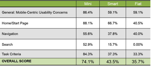
I recently conducted a mobile expert review of three auto manufacturer mobile websites (MiniUSA, SmartUSA, and Fiat) in order to assess their overall user experience and ease of use. I used a handful of usability metrics and assigned scores to each of them in order to determine which mobile site was the most user-friendly. Here are some of the top-level findings and results from my review.
Usability Metrics
- General: Mobile-Centric Usability Concerns – Is the site optimized for mobile?
- Home / Start Page – Are key tasks easy to locate on the home / start page?
- Navigation – Are there convenient and obvious ways to move between pages and sections and is it easy to return to the homepage?
- Search – Is it easy to locate the search box? Can you easily filter/refine search results?
- Task Criteria – Is the info on the site presented in a simple, natural and logical order?

Top-Level Findings
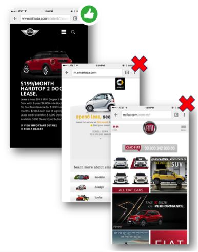
- Location of search icon was quick and intuitive on the MiniUSA site – Quick access to search is a must these days. The MiniUSA site was the clear winner in this respect, as SmartUSA and Fiat failed to provide a search feature on their homepage.

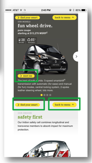
- Uncommon, small CTAs were problematic on the SmartUSA site – Several CTA’s, such as ‘meet me’, ‘back to menu’, and ‘find your smart’, on the SmartUSA site proved to be quite confusing, as it’s not clear where users would be taken if they clicked/tapped on these CTAs. Also, with very precise touch targets, the CTAs were very small and difficult to tap on.

- Homepage on the Fiat site provided minimal direction – It was not intuitive where to begin a search when looking to buy/lease an automobile. Additionally, while the burger menu was easy to see and access, it provided options far too vague for users to know where they needed to go subsequently to continue their search.

Now that I’ve shared a few examples from an expert review of my own, here are some tips for how to conduct an expert review of your own. While conducting an actual usability test of your mobile site is the ideal route, conducting a quick usability review is still a great start!
Tips for Conducting a Mobile Expert Review
- Identify the critical goals and tasks of your mobile site –It is imperative that you identify the primary goal(s) of your site so that you can know what usability issues are wreaking the most havoc on your bottom line. For example, if you are in the clothing business and you have seen a recent decline in online sales of t-shirts, a crippling usability issue may be present that is preventing users from completing the checkout process, hence the decline in sales. In the e-commerce world, shopping cart abandonment is an extremely widespread issue. Therefore, by conducting an expert review you’ll be able to uncover the specific error(s) occurring at major touch points within the checkout process that are impeding your customers from completing their purchase.
- Define your typical users via a customer persona –The majority of web, mobile sites, and applications have typical users who share a relatively familiar set of skills and expertise when it comes to critical tasks. It’s the job of your organization to identify a “Persona”, which is basically a fictional representation of your typical user or customer. Constructing and modifying your mobile site based on your specific customer personas will allow you to custom tailor site attributes such as terminology, information architecture, and navigation schema precisely to the customers that will be interacting with your site most often.
- Don’t just look at your site, go use it! –This is the part of the expert review where the hands-on review takes place. Since you’ve already identified the critical goals and tasks of your site, as well as your customer personas, now you can put yourself in the shoes of your customers and go through those critical tasks yourself. Take the previously identified critical tasks and walk through them one at a time as if you were the customer, all the way down to completing the t-shirt purchase (using the aforementioned clothing business example).
Now that you’re equipped with some tips for how to conduct a great usability expert review, you can grab your smartphone and put this recently acquired knowledge to work. Your managers, business owners, stakeholders, and most importantly your customers, will surely thank you!
by KLI | Nov 12, 2014 | Conferences, Cultural Impact, Humor, iPhone, mobile, usability, UX
by Kelly Nercess
Lets face it. We live in a society where the majority of people are glued to their mobile devices. Whether it’s texting a friend, finding an online recipe for dinner, or taking a selfie…everyone, at one point or another, is guilty of being attached to their smartphone.
During the Big Design conference in Dallas this year, I had a chance to attend Pamela Pavliscak’s workshop on “ The Real Mobile Experience”. Aside from her entertaining jokes and quick wit, she gave us a her insights on what people really do on mobile phones and how to design for those activities.
Some quick facts:
– For every baby born, there are five mobile devices activated
– 7 billion mobile phones in the world. 55% of those are smartphones
– Typical mobile users check their phones 150 times a day
– Smartphone owners spend over 2 hours on their phone each day
– 21% of US mobile phone owners go online primarily using their phones and globally that number is even higher
– Out of preference: 50% of smartphone owners under 30 use the Internet primarily on their mobile phone
– Out of necessity: 55% of Americans who make less than $30k/year have no web access at home
– For convenience: 34% use the device simply because it is close at hand
– 29% say that their phone is the first and last thing that they look at everyday
– 44% sleep with their phones (in a very platonic manner)
Based on the data that Pavliscak reported, people show a remarkable dependency on their smartphones. The fact that we now wake up and go sleep with this electronic device by our side can even be intimidating for a spouse. Women were asked if they would rather give up sex or their mobile phone for 1 month. Can you guess the answer? 48% of women said they would rather give up sex, while the other 52% said they would rather do without their mobile phones. Hmm, interesting. Where do you fall on the spectrum?
An experiment was performed where she asked 250 people to “take a look at their phone”. She was requesting the owner to just happily pass their phone over to a perfect stranger. The result:
– A slim amount of people actually handed over their phone
– Some made an excuse not to pass it over
– Some also just instantly put their phone away
– Majority of people would hold the phone out and show it while it was still in their possession
So, what does this mean for society? We are way too overprotective of our phones. It’s as if it was our newborn child.
In addition to our phones providing a channel for enhanced social interactions, they also allow us to also solve problems. Pavliscak reported that 86% of people solve problems with their phones, which includes troubleshooting emergencies. What else do we use our devices for? High on the list is making sure our kids are happy. Only 20% of parents don’t use tablets or phones to keep their children occupied. So next time you are at a restaurant and you see a young child playing Angry Birds as opposed to eating their macaroni and cheese, you can look at them and think “Oh, you’re part of that 80%”.
We all know that we love and adore our phones, but what are we really doing on them? Ms. Pavliska proposed another experiment to research what we are spending our time on when our eyes are glued to that mobile screen. Even though we look at it over 150 times a day, we’re usually using it in three ways:
– 72% of the time we Tap
– 77% of the time we Swipe
– 94% of the time we are Scrolling
People know how to use the zoom button, but surprisingly a lot of us will continue to read the small text as opposed to using the gesture to make it larger. How can we optimize the mobile experience based on this data?
– Take the guesswork out for the user, but give them obvious cues
– Get rid of any needless gestures
– First impressions hold the most value for The Flick (scroll down to the bottom, and then quickly back up to the top)
– Don’t have to many hidden menus for when a user applies the The Washing Machine method (someone who swipes up and down/right and left)
– We go to great lengths to avoid typing, so consider that when designing your mobile site
– Use icons in a way that is consistent with other sites
– Essential content should be on the page or on the top (hamburger menus are iffy)
– Sound cues are a missed opportunity – only 74% of people leave their ringer on
Overall, there is much room for improvement for the user experience of mobile devices. They are attached to their phones almost as if it were another limb. Aside from the great content she was able to share, she had an upbeat and entertaining presentation style that did not go unnoticed by the crowd. If I get the chance to attend another talk by Pamela, I won’t miss the opportunity!
by KLI | Sep 10, 2014 | Android, App Development, e-commerce platforms, mobile, usability
by Kathleen Henning and Phil McGuinness
In part two of our series on mobile payments, Phil and Kathleen review a few exciting mobile payment options and talk about the near future of mobile payment technology.
Phil: In part one, Kathleen and I field tested the PayPal and Google Wallet apps, two popular forms of mobile payments. However, there are a few up and coming forms of payment that take a different approach to the process.
Softcard/ISIS
Due to an unfortunate coincidence, the company ISIS is in the process of changing its name to Softcard to avoid sharing its name with a militant terrorist group. However, that’s not the only obstacle facing Softcard. While Google Wallet restricts the use of Near-Field Communication (NFC) payments to Android, Softcard is bringing these payments to the iPhone as well. In order to do that, users need to make a one-time investment in a special phone case (minimum of $50).
Requiring users to invest additional money to make payments creates a difficult barrier to adoption, especially when NFC payments aren’t yet accepted on a widespread basis. Softcard does, however, address one of our gripes about Google Wallet. It allows users to search for local stores that accept NFC payments. The app also boasts numerous security features on their site, including a PIN entry required before each purchase, the ability to freeze your wallet remotely, as well as using unique transaction IDs for each payment.
LoopPay
Instead of relying on NFC, consumers have another option in LoopPay. LoopPay gets around NFC by imitating credit cards in a way that allows the familiar credit card readers to get the signal. This allows LoopPay to work in almost any store, using the technology that’s already in place. As with Softcard, though, this also requires the user to make an initial investment. At this time, Loop Wallet provides the option of a reasonable $39 for a key fob, or $99 for a charging phone case and key fob.
As NFC adoptions treads water, LoopPay is an interesting alternative to watch. At the time of this writing however, Apple is expected to announce NFC as a standard in the iPhone 6, which could change the field dramatically. Kathleen, our resident Apple expert, will break down the rumors and implications this could have later in the article.
Coin
Another interesting option in the mobile payment field is the Coin Payment Card. This works similarly to LoopPay, but instead of requiring a fob or charging case, users can store their cards in a credit card-shaped item and switch between them at the tap of a button. This has the added benefit of removing any questions of NFC adoption or security concerns with wirelessly transmitting credit card information. In addition, it provides the comfort of a payment process with which both users and vendors are familiar. There is no need to fumble with a mobile app or worry about having mobile service if you can simply hand a card to a waiter or cashier.
Another neat feature unique to this system is added security through a Bluetooth tether. Coin uses a low-energy Bluetooth signal to connect with your phone, which will then alert you if you get too far away from the card, say by walking away from a shop and leaving it on the counter. So what’s the downside? Again, users need to invest in the card, and right now it is still in the crowd funding stage. Early investors can buy the card for $50, and once it’s released it will retail at $100. If somehow Coin can manage to bring the price down, I could see this being widely adopted by consumers interested in both familiarity and security.
Now, Kathleen will talk about Starbuck’s success with mobile payments and Apple’s likely upcoming adoption of NFC in the new iPhone.
 Starbucks
The best part of the Starbucks app is how little effort it involves. Once you enter in your gift card number and the 8-digit identifying code on the back, you’re good to go. You can add money via the app, set it up to automatically reload when running low, and even add it to iOS’s Passbook. Using it in the store is a seamless process. Unlike some of the other apps we’ve tested, it just works. You don’t have to think about it, and since the store has integrated it on their end paying by app is as natural as paying by credit card. This too works independently of NFC capabilities.
Starbucks in Korea has a new feature called Siren Order. Customers can enter in their order details and receive a QR code, which is scanned by baristas at the counter. Starbucks is thinking about rolling out app preorder capabilities in the US in the next three to six months.
 Apple Pay
As of September 8, 2014, Apple has entered the mobile payments field with Apple Pay. As of January 2014, 42% of smartphone owners in the US own some model of iPhone, many of these older models. Apple Pay will work on the iPhone 6, the iPhone 6 Plus, and the Apple Watch. Users will scan the front of their credit/debit card, enter the CVV, and be able to make payments. Apple will generate a unique code each time a user wants to make a payment. This will work in physical stores, online, and in apps. Merchants like Starbucks, Whole Foods, Duane Reade, Disney, Bloomingdale’s, and Uber are already signed up. American Express, Visa, MasterCard, and most major US banks are currently participating on the credit/debit card side. I look forward to seeing how this transforms the mobile payments process, hopefully for the better!
Personally, I’m optimistic for a trickle down effect to smaller merchants by next summer so it can be available at Smorgasburg and Governor’s Ball. A lot of the payments systems we’ve showcased are promising, but none of them have gained widespread adoption. I’m hoping Apple’s entry into the market will change this outcome.
by KLI | Aug 7, 2014 | Android, e-commerce platforms, mobile, usability
By: Kathleen Henning and Phil McGuinness
After a challenging experience with mobile payments at a New York music festival, our researchers decided to get together and assess two of the leading mobile payment options currently on the market. In Part One of this two-part series, we field test PayPal and Google Wallet apps on both iPhone and Android smartphones. Next month, we’ll review the mobile payment landscape and share some interesting new developments.
Let’s see where Kathleen Henning and Phil McGuinness stand on these mobile giants.
Kathleen: As I was preparing to attend the Governor’s Ball festival this summer, I was super psyched. Not only did they have an amazing lineup, but the food & drink section asked for my credit card information so I could make mobile payments. Since I hate carrying cash (and really anything), this was a dream come true for me. Unfortunately, it was a little too good to be true. I entered all of my information only to find that no one was accepting the GovBall app as payment. Instead, there was the PayPal app…
Most festivals, for better or worse, are known for having notoriously awful cell service. GovBall was no exception. Using the PayPal app required downloading it, logging in, taking a picture of yourself, and saving your account information. All of those steps required far more Internet speed than was available. Day 1 I had no luck. Day 2 I was able to purchase free Brooklyn Soda Works. Day 3 the vendors I tried weren’t accepting it anymore because of technical failure.
This experience got me thinking, does this app work any better with a stronger signal? Was my experience simply based on the context of the festival? I opened up the PayPal app, looked through the local businesses available, and took a trip to Van Leeuwen’s for a (mostly free) scoop of ice cream with ridiculously delicious fudge. The app worked! And then it crashed my iPhone. However I was able to pay and get the $5 coupon discount and, more importantly, enjoy a little piece of ice cream heaven.
Phil: After Kathleen and I discussed her experience, I went ahead and tested the take out ordering for the PayPal app on Android. I found that it works like any food ordering app. All mobile ordering relies squarely on the structure and capabilities of the Eat24Hours service. My experience with setup was fairly easy, although you have to enter a lot of basic information, including a picture, which might deter some people.
After set up, I found that the app was slowing down the ordering process with numerous errors. At first the PayPal app was stuck on the “delivery” setting for food, and even when I toggled the setting to “takeout” the delivery fee and minimum order remained on screen. The app’s ordering function also repeatedly timed out with a plain text screen reporting an unspecified error. On top of all this, the ordering process was generally very slow to load. Feeling discouraged, I shut down the app for the day and ordered through other means.
One error encountered with PayPal: Despite selecting “Pickup” the app still thought I was ordering “Delivery”.
The next day I opened the app again to order some lunch, and thankfully the process went smoothly. I was able to pick up my food without any hiccups. I hope that the errors Kathleen and I experienced will be worked out over time, so the app can become a more reliable source of ordering.
Google Wallet doesn’t provide a method to find local stores where payment is accepted, limiting its effectiveness as a wallet or credit card replacement
I also reviewed Google Wallet on Android, a mobile payment app whose main point of differentiation is the use of Near Field Communication (NFC) for point-of-sale payments. Since I had already used Google Payments in the past, the setup was quick and easy. The trouble started when I tried to find a location to use the payment method. Google’s site doesn’t provide any list of merchants where Google Wallet payments are accepted. This may be due to vendors being slow to adopt NFC, which is necessary for this type of payment to spread. Unfortunately this leaves the user to find locations themselves, making this convenient method of payment not so convenient. I spent a week in Silicon Valley and a week traveling and I didn’t find a single location to make a payment with Google Wallet. With limited adoption and no means for finding out where this type of mobile payment is accepted, Google Wallet is far from replacing my trusted standard leather wallet.
Kathleen: In this day and age, there’s a lot of potential for mobile payment systems to streamline a manual process. I was at a concert recently where the luxury box seats were offered a paper menu to select menu items and have them brought to your seat. This section was organized by Live Nation, the international promoter. A setting like this one would be perfect for mobile payments. If I could log into my Live Nation app, select what I want from the menu, hit submit, and have it delivered to my seat, I would be so happy!
In conclusion: There are definitely still some usability issues in this area, but we here at Key Lime Interactive are super excited about the future of mobile payments, especially at concerts and music festivals! Next month, we’ll review the current mobile payment landscape, including some novel new approaches to address problems like those Kathleen and Phil encountered above. Until next month…