by KLI | Aug 28, 2015 | Medical, Personas, usability, UX
by Jonathan Knopf

Whether you ask patients, physicians, or administrators, they all have the same overall opinion of the healthcare system. “Its all over the place.” Your typical radiologist and primary care physician likely have complete different workflows, communication channels, and software systems to document a patient’s care and clearly don’t communicate to each other.
Usability in healthcare is unique in that the creation of more usable systems not only saves time and money on development, but it can also save lives! Some of the usability problems apparent in electronic medical records (EMR) and electronic health records (EHR) include: violations of natural dialog, control consistency, effective use of language, effective information presentation, and customization principles, as well as a lack of error prevention, minimization of cognitive load, and feedback.
As both a UX/UI designer of medical software and a recent ACL reconstruction patient, I became aware of several usability challenges that make designing software for EMR/HER software quite complex. In this article, I will detail five challenges that I have observed and some recommendations for ensuring maximum user satisfaction.
- Legacy Software and Software Lifetime
- This is one of the biggest roadblocks to user satisfaction as making UI improvements may ultimately lead to a Frankenstein software appearance; great UI components may stick out like a sore thumb when added to an old product. There is a lot of fear involved in improving the look and feel of medical software, particularly due to the risk of user error involved with unfamiliarity. This fear should not impede the progress of the product. Software suppliers could potentially risk more by not modernizing their software. Prior to rolling out a UI overhaul, make sure your users are on board with your changes. If not, make sure they have the ability to revert to a previous version (ex. “Modern View” vs. “Classic View”).
- Personas, Personas, Personas
- In healthcare, personas are not primarily for patients, but rather for the specific types of health care providers who use software to treat their patients. The differences between how an admin uses EMR software and how a radiologist uses it are drastically different, both in motivators, features needed, and workflow. It is absolutely critical that you focus on identifying each provider’s persona so you can ensure that the software is providing optimal relevance, efficiency, and ease of use for their workflow. With so many abbreviations and acronyms in the medical world, make sure you are using terms that are familiar to all of your personas.
- UI Design Alignment and Customization
- If you manage more than one UI with different features and workflows, you will need to consider the value of customizing vs. standardizing. Standardization is preferred, but maximizing workflow efficiency is likely more important to users than maintaining the same look and feel. Wherever possible, put your designs in front of your various personas and conduct UX research to determine their preferences and needs.
- Intuitiveness and Cognitive Load
- One of the biggest issues with healthcare software comes from a lack of natural intuitiveness in designs and language. Interfaces should be designed to minimize the cognitive workload on users, not rely on them to follow instructions from a manual, which they seldom read. Elements should be positioned where they follow a simple logical order, provide clear feedback regarding next steps, and minimize the number of steps needed to complete an action.
- Error Handling
- A usability concern that appears in every user facing system is its error handling. Make sure that your error messages are placed within the context of the error location, provide visual clues that an error has occurred, and show the user where the error is located. Visual error feedback should be displayed as soon as possible, not after a form has already been submitted. Provide clear and simple instructions as to how the error can be corrected and, where possible, do not allow the user to advance beyond the error point until it has been corrected. Error handling is another important component to put in front of users. Human factors testing can determine if the users see the messages and are able to take the necessary steps to correct them.
Key Lime Interactive is a usability research and augmented staffing agency capable of identifying any usability issues in medical devices and software since 2009. If you are experiencing some of these challenges with your medical device software and need a strategic roadmap for improvement, contact us at info@keylimeinteractive.com.
by KLI | Aug 26, 2015 | remote testing, UX
by Andrew Schall
Understanding how your users think about the organization of content.
If your users can’t find the information that they are seeking, it might as well not be there at all. An intuitive information architecture (IA) is a core part of a user’s experience, but how do you know what would make sense to them?
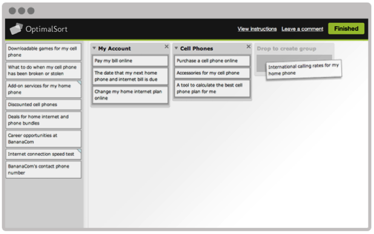
Card sorting is a technique that can help gain insights into how your users think about the organization of your content. This user research method can be performed using an online tool or in-person using physical cards.
The benefits of online card sorting.
Online card sorting has become a very convenient and common way to collect this information from users. The benefits of online card sorting include:
- Fast and easy data collection – participants can log into a website and perform the activity at their convenience.
- Large sample size – it is easy to obtain a large sample size for statistical analysis.

“Image provided by Optimal Workshop (www.optimalworkshop.com/optimalsort)”
Online card sorting has become the predominant way for user researchers to collect this type of data, but it can’t tell you everything you need to know about how to design an intuitive information architecture.
Online card sorting tells you what, but not why.
Collecting data on how your users sort items into categories tells you what they did, but not why they did it. The reality is that designing an information architecture is a messy job, and card sorting can sometimes lead to inconclusive results, especially if the items are particularly challenging for participants to sort.
Qualitative survey questions at the end of an online card are useful, but can’t really help you to get a full understanding of the user’s mental model. There is no way to probe deeper, and participants often give minimal responses to these questions.
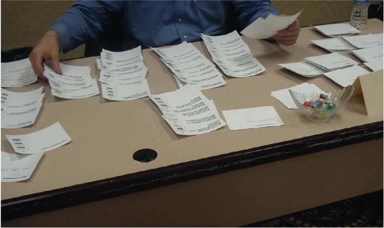
Gaining deeper insights with moderated in-person card sorting.
Moderated in-person card sort sessions are typically scheduled for an hour and are conducted one-on-one with a facilitator. Participants are provided with physical materials that include cards labeled with the name of each item to be sorted, pens or markers for making notes, and sometimes color-coded stickers for further annotations.

“Image from chapter 6, Information Architecture & Web Navigation, Eye Tracking in User Experience Design.”
The ability to manipulate physical cards provides many benefits to the participants including:
- Easier to complete – physically sorting cards into groups requires less instruction compared with learning how to use a new online tool.
- More flexibility – participants can put aside cards on a table and spread out as much as they need. They can write on the cards, cross things out, make suggestions, and draw out connections between cards, including cross-linking.
- Higher engagement – participants tend to be more engaged when they are physically moving cards around. They are also less likely to be distracted compared with performing the activity remotely on their own.
The ability to sit with a participant as they sort cards provides many benefits to the researcher including:
- Understand participant’s thought process – think-aloud protocol can be used to have the participant explain why they are sorting cards in a certain way.
- Observe nonverbal responses – do they appear confused or frustrated? Do they visibly hesitate to place a card or create a label for a category?
- Provide motivation – card sorting is a laborious and mentally demanding task. Participants often lose motivation to complete the activity. The facilitator can provide encouragement to the participant to keep going.
Moderated in-person card sorting is more time-consuming both in data collection and analysis than online studies. However, tools are available to reduce the time needed to analyze data.
- Bar code scanner – bar codes can be used to tag each card and can then be scanned into a computer.
- Utilize software tools – the same analysis tools can often be used to analyze the results from an in-person card sort.
Combining the best of both methods.
A hybrid approach that includes online and offline card sort activities will provide a more holistic understanding of how your users envision an information architecture. In this approach, it is recommended to start with an online open card sort study to see general trends in how users sort items. Next, follow up with an in-person study with a smaller sample size to understand a participants’ thought process including insights into how they would use the content.
by KLI | Sep 8, 2014 | Conferences, mobile, Mobile Marketing, Social Media, Strategy, usability
Overall words to describe the Big Design Conference 2014: Jam packed, smart people, memorable and, of course, Phil freaking Tippett. In case you don’t know this legend by name, he’s been the visual effects creative mind behind on Star Wars and Jurassic Park! Here’s the highlight reel on Day 2 to close out this exciting two day conference.
Do You Trust Me Now?: Content Convergence in the Age of Social Media by Rahel Anne Bail @rahelab
Rahel talked about having a content marketing strategy. The quicker your company realizes that everyone is a brand ambassador, the more successful you’ll be. A couple takeaways:
- Unless we’re creating content meant for social validation and social interaction, we’re not doing it right.
- Social media is not the same as social business. One-way communication is not social. It’s advertising.
- Customers may claim that they don’t care about social in business context. They’re in denial.
Give a hoot! Mapping (and caring for) the Semantic Environment by Jorge Arango @jarango
This lively (and academic talk) had audience members shouting “Give a Hoot!” throughout the presentation in order to confirm salient points. Jorge taught us how human beings react to and derive meaning from language and the nuances of context. For example, responsive has a different meaning for web designers vs medical device developers. Be thoughtful about the semantic environment in your writing.
The Design of Content: Strategies for Lasting Impressions by Keith Anderson @suredoc
Keith argues the point that the design and reading experience has been improving since the 1450s. He takes his theories from Gestalt psychology, the idea of what the eyes take in the mind will process as a whole. Takeaways from the presentation include:
- Content strategy can be defined as the art AND science of controlling the creation, storage, maintenance, and dissemination of words and their associated assets and context to be congruent with an organization’s goals.
- The User Experience movement has simultaneously helped and hindered how we communicate.
- Our job as content writers is to anticipate readers’ expectations and provide them with quality content within a context perspective.
- Take your content seriously. Write and design with a purpose.
- Take the time to conduct reader research. Build profiles, conduct surveys, and make sure you understand what they expect from you.
Body Language: Hidden UX Insights from Body Language by Brad Nunnally @bnunnally
Brad cited scientific examples that included the fact that human beings make decisions 7 seconds before they physically communicate them. If we can focus in on body language we’ll get an early indication and non-verbal confirmation from our qualitative work.
Lights, Camera, Interaction: Design Inspiration from Filmmaking by Adam Connor @adamconnor
We’re not filmmakers but in the interest of broadening our horizons we decided to take a closer look. What a treat to step outside the walls of marketing and UX-concentrated workshops to learn more about design in film-making. Adam took his passion for film and his experience in design to share his unique perspectives. Fun fact: Designers with a creative vision are often not put in the position to manage. There is a big difference between leadership and management. Here are some facts we came away with:
- Leadership is about vision and inspiration towards the future of that organization.
- Management is to keep things together and MANAGE the organization, not necessarily lead the creative path.
- Scenarios are the interaction between a persona and a use case.
- Mise en Scene: All of the tools other than dialogue, used by a filmmaker to tell a story (everything to design the scene that does not include any actual conversations).
Lessons I Have Learned from Leading UX Designers by Russ Unger @russu
This talk was brimming with great leadership advice that can be applied to any process. For now we’ll just share our favorite quote:
A leader is best when people barely know that she exists
when her work is done and her aim fulfilled they will say – we did it ourselves – Lao Tzu
You’ll have to wait for the blog post for the good stuff.
Headlines, HBO, and Harry Potter: A Case for Context by Justin Smith @xenoabe
Justin can win the award for most compelling topic title. Yes, he did briefly discuss Harry Potter and HBO and how they relate to compelling context. The audience also got to watch a very touching TD Bank commercial, which proves the case that meaningful context can really draw the emotions you are seeking for from your viewers.
- Context is the circumstances that form the setting for an event, statement or idea, in terms it can be fully understood.
- Context is like a green screen.
- Sometimes you don’t want to give it all away in your headline. You want to be mysterious It’s ok to play with the user and some fun with your messaging.
Mitigating Scope Creep: Useful Tips for Project Peace by Michael Vaughn
Another good tactical approach presentation. Our top takeaway here centers on taking accountability when you start a project. Accountability for your company AND for your client. If you have a clear understanding of your roles then it’s easier to maneuver the project segues when they happen….cause they WILL happen.
Why Photos Rule The Internet by Tony Cecala @tonycecala
Companies like Target, Starbucks, UPS and Fedex have such a strong brand image that their logos can do all the talking. From passing a billboard in Times Square or swiping through your newsfeed on Facebook, you’ll recognize the logos of these brands. It’s a brilliant visual communication tool….once you have that kind of brand recognition.
- When building an identity for your logo and image, put a fair amount of consideration in to the design and colors you choose.
- Memes have become a popular way brands can communicate with a younger audience.
- Text and image-based posters used for political campaigns were memorable prior to the internet and can be considered a “meme” (think Uncle Sam).
- Facebook beats out Instagram, Snapchat and Flickr as the #1 outlet for photos and images to share your life with your friends.
- Tweets with images get 150% more retweets
- Tweets with images get 18% more clicks
Produce Like Picasso by Brian Sullivan @brianksullivan
We have one word for Brian’s presentation to close out the workshop portion of the conference: INSPIRATIONAL. Brian delivered a compelling presentation on the much-admired artist, Pablo Picasso, and showed us how to apply Picasso’s work ethics into our daily lives. Here is the secret, it is 5 Ps:
- Passion
- Purpose
- Proficiency
- Persistence
- Partnership
Our keynote closer was Phil Tippett and for this crowd it was quite a treat. Phil is best known for his VFX work on some of Hollywood’s most beloved movies including the Star Wars triology and Jurassic Park. It’s no wonder he’s crowd favorite at Big Design. We were struck by his opening statement that he isn’t a digital designer at his core but a student of art history. He loves making things with his hands and is still committed to stop motion animation. It was a nice ending to a great conference.
We’ll be sharing more opinions over the next few weeks so stay tuned if you want the inside scoop on BigDesign Dallas 2014.