We’ve found that the first few minutes of a Virtual Reality (VR) experience can entice users to delve deeper or make them lose interest completely.
Join Key Lime Interactive team members, Rick, Levi, and Eugene, for a thirty-minute exploration of how to define the virtual reality relationship early and how to create a user experience that will make your users fall in love at first sight.
Best Aspects of Online & Mobile Shopping Experiences
In Key Lime Interactive’s (KLI) 2015 Holiday Shopping Report, the results from its January post-holiday survey of 500 consumers was revealed. The report focuses on consumer spending behavior as it relates to online and mobile purchases during the holiday season.
The report examines consumers’ usage of different channels (websites, mobile apps, mobile sites, brick-and-mortar stores, and more), tendencies to use different devices (Smartphones, tablets, laptop/ desktop computers), as well as the top triggers and influencers that lead consumers to make online and mobile purchases (such as marketing, promo codes, free shipping, convenience/ speed, and brand loyalty).
KLI reveals how, where, why, and how much consumers spent during the 2015 holiday season, including:
Which retailers are winning in the online and mobile channels?
What are the most effective and enticing incentives?
Did consumers spend more or less online this year?
Have mobile purchases increased or decreased? And why?
What made for the best online and mobile experiences?
When starting a new career in UX, having a great portfolio is the best way to really set you apart from your peers. Once you have had a chance to start putting together work experience, here are some key tips to develop a portfolio:
Select the right platform for your portfolio.
When creating a new website there are so many options. Do you start from scratch with a GoDaddy Account? How about a WordPress site? What template to use, or should you use one at all? Sites like Squarespace, Carbonmade and Cargo Collective are great places to start. Here’s an article that compares the different sites available.
Develop an online brand for yourself.
In today’s digital environment, your online presence is what people see most often. I read countless articles about people who don’t get a job because of something on Facebook, or other social media sites. This doesn’t directly relate to building a portfolio, but I think it’s just as important. Before you begin your job search, Google stalk yourself. If you see things you wouldn’t want your employer to see, make sure to get rid of them right away. A gorgeous portfolio cannot save a disaster photo from someone’s bachelor party.
Create a logo and theme for yourself.
Whether you choose a pre-made template or create one from scratch, having a beautiful logo and design will impress those who visit your site. Work with a mentor to see what works best for your brand, and keep it consistent.
Make sure your site is well-categorized and shows a depth of experience.
When we recruit an applicant, we want to see how diverse their work experience is. Do you have prototyping experience? Wireframing? Design experience? Usability Testing? Including these types of categories in your website will diversify you. Also, make sure to highlight specific industry experience. When we have a new client that is looking for someone with experience in that respective industry, it is very helpful to be able to call it out.
Make sure your website is optimized for the User Experience.
I know this sounds like a no-brainer, but it is really important. Since the potential employers are experts in the UX industry, if there is a usability fail in your website, it would be the difference between getting hired or not, despite how great everything else is. When Key Lime Interactive updated their website, we actually ran a few lean UX tests to obtain feedback on the changes we made. This allows for another great opportunity to network with people in your community, and let them know you are serious about your career in UX. Once you have these pieces set up, you are ready to get out into the community and start interviewing. With a great portfolio set up, you should have the confidence to land your dream job.
Wearables are fun and cool, but aren’t always useful or usable
An exciting array of new smart wearable devices are available to consumers, but very few have proven to be useful enough to become a staple of our daily lives.
The wearables experience is very different from that of any other portable device. In the morning a smartwatch might vibrate to get your attention to look at it because you have a meeting in 10 minutes. The device might alert you that you have reached your target heart rate while exercising. The user might then swipe the screen a few times to change to a different song track.
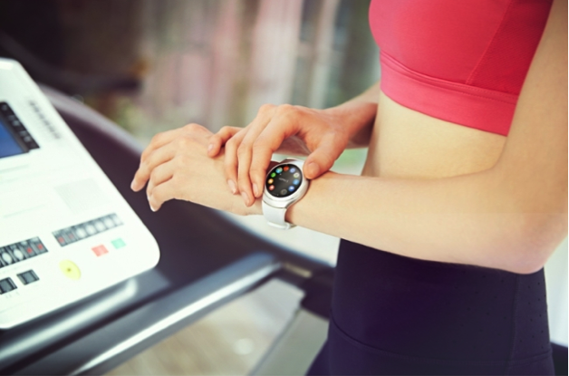
Samsung Gear S2 used during a workout routine. Image courtesy of Samsung.
User experience teams have been able to collect lots of data about usage habits through diary studies and run usability tests to understand if users can use these devices. While informative, these methods are unable to capture the subtle, yet critical behavior of visual attentiveness.
Improving the user experience of wearables
Eye tracking can help researchers to better understand how users are viewing wearables and to identify usability issues that might not be detected by direct observation of participants in a usability test. At Key Lime Interactive, we have been working on new methods for analyzing eye tracking data that are most applicable for studying wearables.
Our goal is to establish benchmark metrics for a variety of wearable devices and apps so that we can help our clients understand how their products compare and to make suggestions for improving the user’s experience.
Visual attentiveness is key to understanding the UX of wearables
Visual attention is still the primary way for users to obtain information from and interact with wearable devices. Users stop, check the device display, interact easily and quickly, and then move on. They spend only seconds in an app at any given time, rather than minutes. By providing just the right information, at just the right time, users can get back to focusing on the real world more quickly.
A poorly designed app requires the user to spend significantly more time looking at the wearable device which then disrupts the user from their primary task and reduces the overall utility of wearing the device.
The user’s interest in engaging with the device can be measured by the frequency with which they look at it. A useful wearable device should be frequently glanced at for short amounts of time, providing bite-sized amounts of information, similar to quick glances at a regular analog watch.
The word taxonomy is essentially defined as the study of general principles of scientific classification, or the orderly classification of things according to their presumed relationships. In other words, taxonomy is the process of describing how things are related by putting them in groups. So what does taxonomy have to do with user experience? Well, for plenty of organizations, it’s everything.
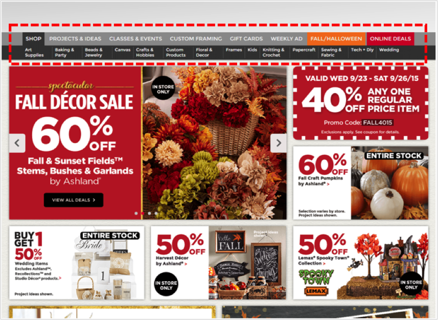
Let’s imagine you were planning a little get together and your plan was to have some friends over for an arts & crafts night where you’d be doing some knitting, sewing, quilting, etc. You hop on your computer and go to the website of your favorite local arts & crafts store to shop for supplies. The first thing you need to get is yarn, you aren’t too sure what kind, but you know you need some yarn. If you look at this example below, you clearly have a decision to make. Within which of these menu categories would you expect to find yarn? Is it ‘Crafts & Hobbies’? Is it ‘Knitting & Crochet’? Is it ‘Sewing & Fabric’? Or is it something else entirely?
While some items on a website are easier to find than others, such as this one, something like yarn may be a bit more difficult. Therefore, it’s up to the company to devote the time and necessary resources to improve the findability of all the products on their website.
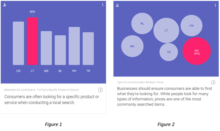
Nothing frustrates web users more than poor navigation and confusing content structure. Per recent data from Google’s Consumer Barometer, the majority of consumers are looking for something specific when they search a website [Figure 1]. Additionally, while we can see that price is often the most important purchase influencer [Figure 2], consumers are incapable of seeing the price of the product they’re looking for if they aren’t able to find it on the website. The principal concern businesses have is the fact that if consumers come to their website to find something and they fail repeatedly trying to find it, they will simply leave the site and go somewhere else.
Source: Consumer Barometer with Google – The Connected Consumer Survey 2014 / 2015
So how can navigation and content structure problems be avoided? Well, the best and most fundamental tactic used to improve site navigation and content structure is to conduct a tree test of your site content. Tree testing is a usability technique for evaluating the findability of products and information on a website.
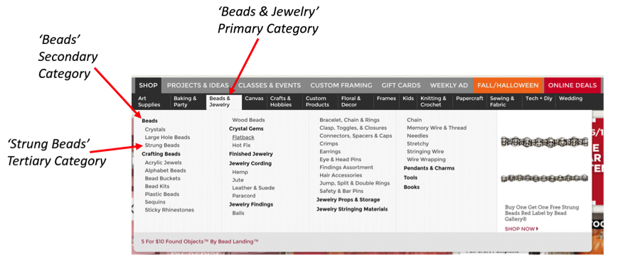
Take the aforementioned arts & crafts website example – you have a website that is organized into a hierarchy (a “tree”) of primary categories and within each of those are sub-categories. A well-organized website is one that makes it easy for the user to navigate through the categories and any sub-categories that follow in order to find what they are looking for. The tree shown in this example below would look something like: Beads & Jewelry > Beads > Strung Beads
How to Conduct a Tree Test
A typical tree test involves several tasks for study participants to complete. Just to give you a quick look at what a tree test would look like, I’ve built out an actual task scenario using the aforementioned arts & crafts website. However, before we look at the example, here’s some general information explaining how tree tests are set up.
Welcome Message
Users are shown a welcome message thanking them for taking the time to participate in the study.
Users are often told the expected length of the study (how long it will take them to complete it), which is typically 15-20 minutes at the most.
Lastly, it’s good practice to let users know that their answers are very valuable in helping to organize the content on your website and that there are no right or wrong answers, as it’s the content being tested, not their ability.
Instructions
Users are presented with a list of links and they are asked to find a certain item.
The user will click through the links in the tree until they feel they have reached a point where they feel confident they would find the item they were asked to find.
Users are informed that if they want to go back for any reason, they can simply click on the link above where they currently are in the process.
Thank You Message
After users complete the task(s) they should be presented with a thank you message thanking them, again, for their participation and letting them know they’re finished and it’s safe to close the browser.
Tree Test Example
As you can see with the above example, users are given a task to find a specific item and then they are shown a set of options to choose from. Within each of those initial options is a set of sub-options and within those sub-options are more sub-options. Depending on the item they are being asked to find, and also depending on how deep the content structure of the site is built out, the number of sub-options and categories will vary.
So, once you’re finished collecting the data from your tree test study, how do you analyze the results? Well, it’s quite simple and it’s fascinating how much you can learn. You would be able to observe and analyze key data points such as:
Success/Fail Rates
Number of Direct Successes – The number of participants that were able to locate the item on their first try without having to go back at any point.
Number of Indirect Successes – The number of participants that successfully located the item, but in doing so they navigated back at some point, then ultimately found the correct path.
Number of Direct Fails – The number of participants that went down the wrong path and selected an option other than where the item they were looking for was located.
Number of Indirect Fails – The number of participants that navigated back at some point, then ultimately selected an option other than where the item they were looking for was located.
Time on Task Metrics
You can obtain the mean (average), median, and mode as it relates to the time it took each participant to complete any of the tasks in the study.
Qualitative Feedback
If you wanted to, when building your tree test study you could add a question after specific tasks asking users to provide qualitative feedback, such as why they selected the option that they chose or you could ask them if they had any suggestions for how the process overall could be made easier.
Now that you’re equipped with some knowledge on tree testing and have some fresh examples to reference, take a look at your website and ask yourself if your site’s content is organized in a way that it’s providing the best possible experience for your users. Provide your customers with a pleasant user experience, help them find what they’re looking for quickly and easily, and you’ll be on your way to reaping countless benefits.


 For a closer look at how eye tracking can be used to understand your user’s behavior with wearables, check out our white paper: