Taxonomy and Using Tree Tests to Optimize Site Navigation and Content Structure
by Matt Bruce
The word taxonomy is essentially defined as the study of general principles of scientific classification, or the orderly classification of things according to their presumed relationships. In other words, taxonomy is the process of describing how things are related by putting them in groups. So what does taxonomy have to do with user experience? Well, for plenty of organizations, it’s everything.
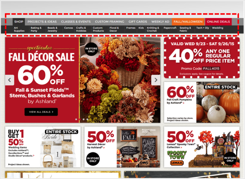
Let’s imagine you were planning a little get together and your plan was to have some friends over for an arts & crafts night where you’d be doing some knitting, sewing, quilting, etc. You hop on your computer and go to the website of your favorite local arts & crafts store to shop for supplies. The first thing you need to get is yarn, you aren’t too sure what kind, but you know you need some yarn. If you look at this example below, you clearly have a decision to make. Within which of these menu categories would you expect to find yarn? Is it ‘Crafts & Hobbies’? Is it ‘Knitting & Crochet’? Is it ‘Sewing & Fabric’? Or is it something else entirely?
While some items on a website are easier to find than others, such as this one, something like yarn may be a bit more difficult. Therefore, it’s up to the company to devote the time and necessary resources to improve the findability of all the products on their website.
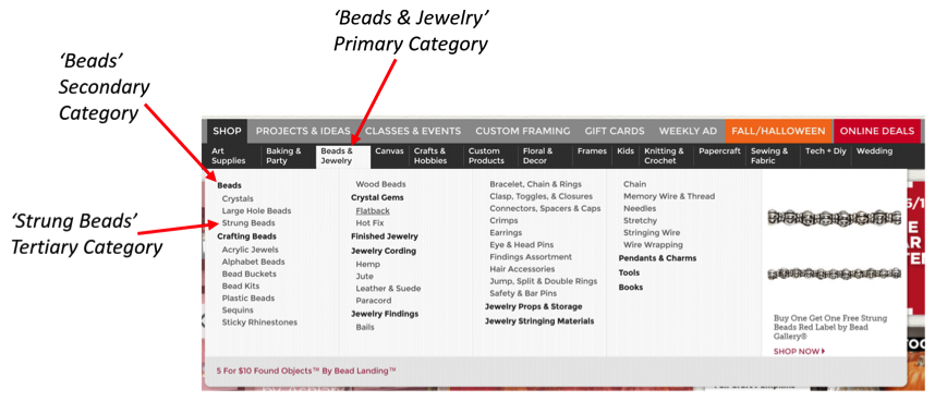
Nothing frustrates web users more than poor navigation and confusing content structure. Per recent data from Google’s Consumer Barometer, the majority of consumers are looking for something specific when they search a website [Figure 1]. Additionally, while we can see that price is often the most important purchase influencer [Figure 2], consumers are incapable of seeing the price of the product they’re looking for if they aren’t able to find it on the website. The principal concern businesses have is the fact that if consumers come to their website to find something and they fail repeatedly trying to find it, they will simply leave the site and go somewhere else.
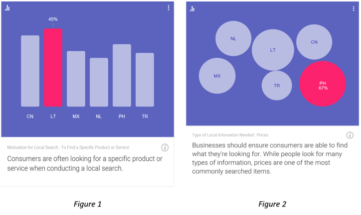
Source: Consumer Barometer with Google – The Connected Consumer Survey 2014 / 2015
So how can navigation and content structure problems be avoided? Well, the best and most fundamental tactic used to improve site navigation and content structure is to conduct a tree test of your site content. Tree testing is a usability technique for evaluating the findability of products and information on a website.
Take the aforementioned arts & crafts website example – you have a website that is organized into a hierarchy (a “tree”) of primary categories and within each of those are sub-categories. A well-organized website is one that makes it easy for the user to navigate through the categories and any sub-categories that follow in order to find what they are looking for. The tree shown in this example below would look something like: Beads & Jewelry > Beads > Strung Beads
How to Conduct a Tree Test
A typical tree test involves several tasks for study participants to complete. Just to give you a quick look at what a tree test would look like, I’ve built out an actual task scenario using the aforementioned arts & crafts website. However, before we look at the example, here’s some general information explaining how tree tests are set up.
Welcome Message
- Users are shown a welcome message thanking them for taking the time to participate in the study.
- Users are often told the expected length of the study (how long it will take them to complete it), which is typically 15-20 minutes at the most.
- Lastly, it’s good practice to let users know that their answers are very valuable in helping to organize the content on your website and that there are no right or wrong answers, as it’s the content being tested, not their ability.
Instructions
- Users are presented with a list of links and they are asked to find a certain item.
- The user will click through the links in the tree until they feel they have reached a point where they feel confident they would find the item they were asked to find.
- Users are informed that if they want to go back for any reason, they can simply click on the link above where they currently are in the process.
Thank You Message
- After users complete the task(s) they should be presented with a thank you message thanking them, again, for their participation and letting them know they’re finished and it’s safe to close the browser.
Tree Test Example

As you can see with the above example, users are given a task to find a specific item and then they are shown a set of options to choose from. Within each of those initial options is a set of sub-options and within those sub-options are more sub-options. Depending on the item they are being asked to find, and also depending on how deep the content structure of the site is built out, the number of sub-options and categories will vary.
So, once you’re finished collecting the data from your tree test study, how do you analyze the results? Well, it’s quite simple and it’s fascinating how much you can learn. You would be able to observe and analyze key data points such as:
Success/Fail Rates
- Number of Direct Successes – The number of participants that were able to locate the item on their first try without having to go back at any point.
- Number of Indirect Successes – The number of participants that successfully located the item, but in doing so they navigated back at some point, then ultimately found the correct path.
- Number of Direct Fails – The number of participants that went down the wrong path and selected an option other than where the item they were looking for was located.
- Number of Indirect Fails – The number of participants that navigated back at some point, then ultimately selected an option other than where the item they were looking for was located.
Time on Task Metrics
- You can obtain the mean (average), median, and mode as it relates to the time it took each participant to complete any of the tasks in the study.
Qualitative Feedback
- If you wanted to, when building your tree test study you could add a question after specific tasks asking users to provide qualitative feedback, such as why they selected the option that they chose or you could ask them if they had any suggestions for how the process overall could be made easier.
Now that you’re equipped with some knowledge on tree testing and have some fresh examples to reference, take a look at your website and ask yourself if your site’s content is organized in a way that it’s providing the best possible experience for your users. Provide your customers with a pleasant user experience, help them find what they’re looking for quickly and easily, and you’ll be on your way to reaping countless benefits.