by KLI | Sep 28, 2015 | Uncategorized, usability, UX
by Matt Bruce
The word taxonomy is essentially defined as the study of general principles of scientific classification, or the orderly classification of things according to their presumed relationships. In other words, taxonomy is the process of describing how things are related by putting them in groups. So what does taxonomy have to do with user experience? Well, for plenty of organizations, it’s everything.
Let’s imagine you were planning a little get together and your plan was to have some friends over for an arts & crafts night where you’d be doing some knitting, sewing, quilting, etc. You hop on your computer and go to the website of your favorite local arts & crafts store to shop for supplies. The first thing you need to get is yarn, you aren’t too sure what kind, but you know you need some yarn. If you look at this example below, you clearly have a decision to make. Within which of these menu categories would you expect to find yarn? Is it ‘Crafts & Hobbies’? Is it ‘Knitting & Crochet’? Is it ‘Sewing & Fabric’? Or is it something else entirely?
While some items on a website are easier to find than others, such as this one, something like yarn may be a bit more difficult. Therefore, it’s up to the company to devote the time and necessary resources to improve the findability of all the products on their website.
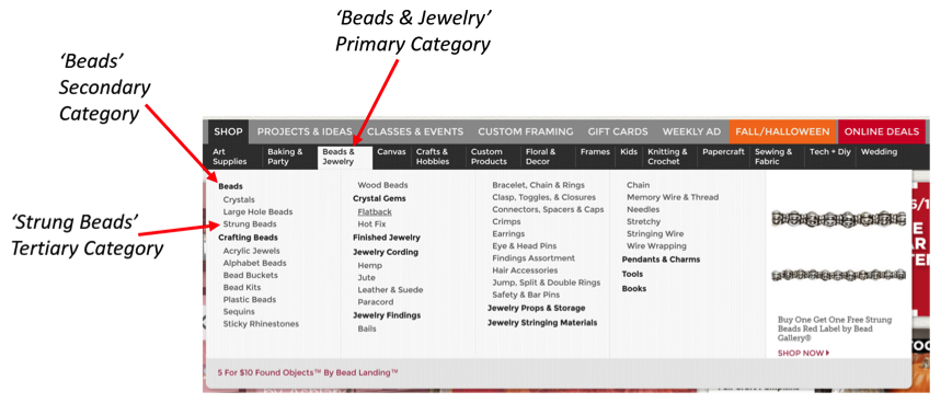
Nothing frustrates web users more than poor navigation and confusing content structure. Per recent data from Google’s Consumer Barometer, the majority of consumers are looking for something specific when they search a website [Figure 1]. Additionally, while we can see that price is often the most important purchase influencer [Figure 2], consumers are incapable of seeing the price of the product they’re looking for if they aren’t able to find it on the website. The principal concern businesses have is the fact that if consumers come to their website to find something and they fail repeatedly trying to find it, they will simply leave the site and go somewhere else.
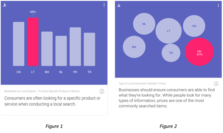
Source: Consumer Barometer with Google – The Connected Consumer Survey 2014 / 2015
So how can navigation and content structure problems be avoided? Well, the best and most fundamental tactic used to improve site navigation and content structure is to conduct a tree test of your site content. Tree testing is a usability technique for evaluating the findability of products and information on a website.
Take the aforementioned arts & crafts website example – you have a website that is organized into a hierarchy (a “tree”) of primary categories and within each of those are sub-categories. A well-organized website is one that makes it easy for the user to navigate through the categories and any sub-categories that follow in order to find what they are looking for. The tree shown in this example below would look something like: Beads & Jewelry > Beads > Strung Beads
How to Conduct a Tree Test
A typical tree test involves several tasks for study participants to complete. Just to give you a quick look at what a tree test would look like, I’ve built out an actual task scenario using the aforementioned arts & crafts website. However, before we look at the example, here’s some general information explaining how tree tests are set up.
Welcome Message
- Users are shown a welcome message thanking them for taking the time to participate in the study.
- Users are often told the expected length of the study (how long it will take them to complete it), which is typically 15-20 minutes at the most.
- Lastly, it’s good practice to let users know that their answers are very valuable in helping to organize the content on your website and that there are no right or wrong answers, as it’s the content being tested, not their ability.
Instructions
- Users are presented with a list of links and they are asked to find a certain item.
- The user will click through the links in the tree until they feel they have reached a point where they feel confident they would find the item they were asked to find.
- Users are informed that if they want to go back for any reason, they can simply click on the link above where they currently are in the process.
Thank You Message
- After users complete the task(s) they should be presented with a thank you message thanking them, again, for their participation and letting them know they’re finished and it’s safe to close the browser.
Tree Test Example

As you can see with the above example, users are given a task to find a specific item and then they are shown a set of options to choose from. Within each of those initial options is a set of sub-options and within those sub-options are more sub-options. Depending on the item they are being asked to find, and also depending on how deep the content structure of the site is built out, the number of sub-options and categories will vary.
So, once you’re finished collecting the data from your tree test study, how do you analyze the results? Well, it’s quite simple and it’s fascinating how much you can learn. You would be able to observe and analyze key data points such as:
Success/Fail Rates
- Number of Direct Successes – The number of participants that were able to locate the item on their first try without having to go back at any point.
- Number of Indirect Successes – The number of participants that successfully located the item, but in doing so they navigated back at some point, then ultimately found the correct path.
- Number of Direct Fails – The number of participants that went down the wrong path and selected an option other than where the item they were looking for was located.
- Number of Indirect Fails – The number of participants that navigated back at some point, then ultimately selected an option other than where the item they were looking for was located.
Time on Task Metrics
- You can obtain the mean (average), median, and mode as it relates to the time it took each participant to complete any of the tasks in the study.
Qualitative Feedback
- If you wanted to, when building your tree test study you could add a question after specific tasks asking users to provide qualitative feedback, such as why they selected the option that they chose or you could ask them if they had any suggestions for how the process overall could be made easier.
Now that you’re equipped with some knowledge on tree testing and have some fresh examples to reference, take a look at your website and ask yourself if your site’s content is organized in a way that it’s providing the best possible experience for your users. Provide your customers with a pleasant user experience, help them find what they’re looking for quickly and easily, and you’ll be on your way to reaping countless benefits.
by KLI | Sep 24, 2015 | usability, UX, UX Fellows
by Yufen Chen
With one fifth of the world’s population, China’s market is divided into Mainland China, Hong Kong, and Taiwan. Hong Kong and Taiwan are considered distinct markets within Greater China, as each have their own spoken and written language. Therefore, products looking to meet the needs of these two markets will have different creative, design, and language considerations. How these customers interact with your products or services from end-to-end can vary quite significantly between these populations and the majority that resides within Mainland China.
When choosing customers to sample from in Mainland China, four city tiers are often considered alongside other demographic, psychographic, and behavioral variables. Most brands choose to conduct research in Tier 1 cities like Shanghai and Beijing, so they get a sample of the largest and wealthiest cities; plus the cultural, political and, technology center of China. However, if the goal is to understand user experience across China and build customer personas, you might consider sampling from China’s other 10 megacities[i] to validate learnings from Beijing and Shanghai. Research on the competitive landscape and how it impacts the user experience must account for different distribution channels and customer access to products across urban cities.
Brands that want to be successful in China have been doing research in Tier 2 and 3 cities. Combined, these tiers have 6x the number of households in Tier 1 cities. In the last decade, many brands have also gone in Tier 4 and even Tier 5 cities to better grasp and map the customer journey.
Appreciating cultural and linguistic diversity is critical to successful data collection in China. There are five major dialectical groups that are mutually unintelligible and covers 200 individual dialects. Experienced Chinese moderators and translators will likely be fluent in two dialects and have no problems distinguishing between local access and comprehending native expressions (common Chinese idioms). For example, a southern Chinese person from Shanghai may often have problems understanding a northerner in Beijing when one speaks too quickly or vice versa. Participants can also be more sarcastic in certain cities over others. Use local moderators and translators whenever possible, particularly as you move beyond testing in Beijing and Shanghai only.
Allowing more time between interviews for mini-debriefs with moderators and translators is also helpful. Often, there is hidden meaning beyond the literal translation, so don’t be afraid to pause between sessions and ask if there is an alternative explanation. An experienced researcher in China will be able to explain the differences in expression, and identify if there is double meaning. Example, use of sarcasm versus someone politely “giving face” and avoiding direct criticism.
Finally, with analysis and recommendations, researchers need to consider that foreign companies are not allowed to wholly own companies in China, which then has an impact on product development and services. Global and regional stakeholders may have limited visibility and control over local implementation. So, whether you’re conducting a study to inform a product launch or market positioning, spend more time in understanding where the research needs are coming from. Particularly with multinational companies, understanding the makeup of your local, regional, and global stakeholder groups will help inform the types of recommendations that have impact and at which level. Otherwise, your recommendations may be interesting but fail in being “actionable”.
Partnering with a larger research agency can help to assure a sense of quality and a more familiar level of service for “new-to-China” companies. As a young industry in China, however, smaller research agencies are often more agile and able to produce research at a lower cost. Fortunately, a number of competitive options have increased dramatically over the last few years.
To identify potential partners, start by joining UXPA China (http://www.upachina.org/en/), which is formerly known as UPA China. Since 2004, this organization has early roots in user experience and can provide a rich network for global companies seeking local partners. The industry is still young and growing in China, providing greater resources for all companies looking to improve their experiences with Chinese customers.
Key Lime Interactive is a global partner with UX Fellows. For more information on conducting global UX testing with our team, email us at info@keylimeinteractive.com. Not looking for a usability partner at this time? Email us to say hi, anyways.
[i] China’s megacities range from population sizes of 5-20+ million each
by KLI | Sep 4, 2015 | Uncategorized, usability, UX
by Troy Abel
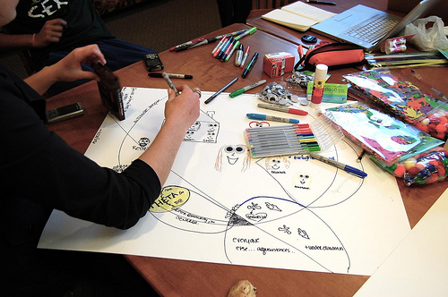
This blog post is an introduction to Participatory Design (PD) and the methodologies that encompass PD. This is the first in a series of PD themed blog posts, so stay tuned for the next installment!
Participatory Design, User-Centered Design, and Human-Centered Design, all refer to methods which involve users and stakeholders during the iterative design process in hopes of meeting the wants, needs, and affordances of end-users. Participatory Design can be implemented in a variety of ways depending on what type of information the team is trying to capture– from design requirements to usability, the choice is yours.
Participatory Design was initially used in the design and development of computer applications and systems in Scandinavia and was referred to as Cooperative Design (Bødker et al., 2004). As the theory moved westward to the US, the term Participatory replaced Cooperative due to the nature of the first applications in business and the need to stress the vested interest of the participants.
The primary goal of PD is to help provide greater consideration and understanding of the needs and wants of system users. Participatory Design can be used to carefully integrate the needs, perspectives, and contexts of stakeholders, therefore, increasing the likelihood of diffusion, adoption, and impact of the resulting user-centered system.
For example, the design of a new mobile yellow page application created to target certain populations and connect users with providers. Wouldn’t it make sense to involve the end-users of this application from the onset of the project? Absolutely! Again, PD can be implemented in a variety of forms, for this example let’s assume we begin by asking our end-users to participate in a design needs session where the design team meets with end-users and fleshes out the necessary design requirements for the mobile app. From the beginning of the project, the users will have their voice heard and incorporated into the design of the final system.
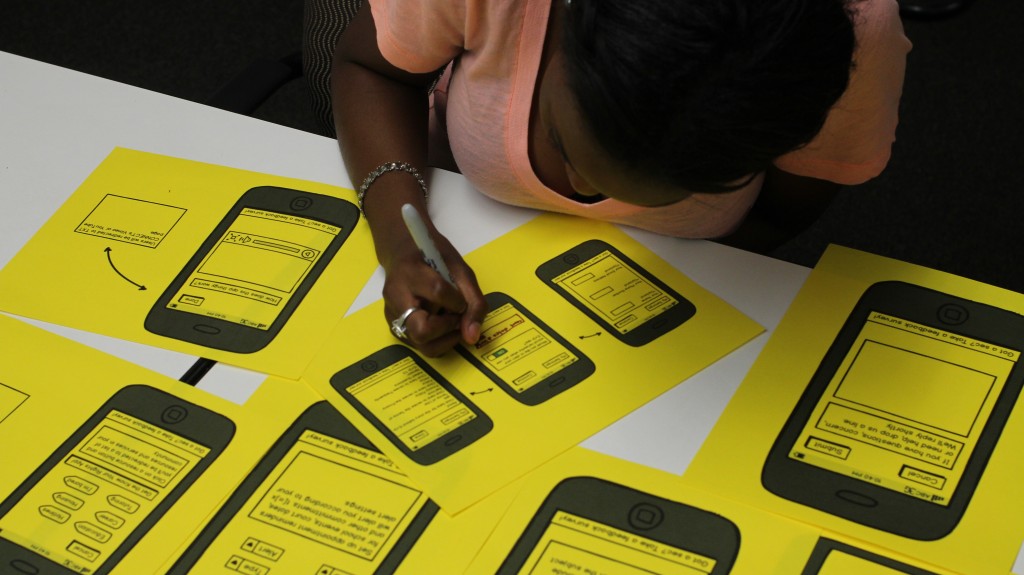
Iterative Usability Testing is paramount to the success of any system, and this is another point where users can assist the design team in shaping the usability of the system. By conducting iterative usability tests, perhaps as short weekly lean UX sprints, the design team and engineers can quickly test and iterate the design of a new system- and be agile in the process.
IDEO has put together its own version of a ‘Human Centered Design Toolkit’. Check it out. Lots of cool techniques, tips, and more to get yourself in the HCD head space.
Remember: by incorporating your users feedback throughout the creation of your system, you are moving towards a better design and adopted system for all stakeholders.
If you have any questions, or want to talk Participatory Design, reach out to us info@keylimeinteractive.com
Bødker, K., Kensing, F., and Simonsen, J. (2004). Participatory IT design: Designing for business and workplace realities. Cambridge, MA, USA: MIT Press.
by KLI | Sep 3, 2015 | usability, UX
by Matt Bruce
Have you ever heard the expression ‘failing to plan is planning to fail’? Well, as true as the expression may be, you’ll often find yourself in situations where things such as time or budget constraints are preventing you from being able to adequately plan and prepare. In the UX world, research and planning are king, and neglecting either of those can be disastrous for your organization. So, what do you do when you find yourself faced with some sort of roadblock and traditional research methods are simply not an option? Well, the answer is guerilla research.
Guerilla research is faster, cheaper, and less formal than traditional research methods. It can provide you with quick, effective insight that can save you and your organization a great deal of time and money in the long run. With guerilla usability testing you will not incur any large costs associated with things like travel, lab rentals, expensive recording equipment, etc. As for saving time, guerilla research is extremely quick and you can get insight in as little as a few hours. With this type of research you’ll be operating from the standpoint that some insight is better than no insight. So, even if the testing you conduct is short and sweet, it’s worth it.
Here is an example of a guerilla usability test I conducted in the past. The objective of this quick test was to learn whether or not users were able to intuitively use some newly proposed icons within a mobile banking app. The bank featured in this example had recently made the transition from a left-hand navigation menu in their mobile app to a more simplistic layout that featured a dock (shown below) of four icons on the bottom of the mobile app’s interface. I tested with 10 participants and tasked each of them with selecting which icon they felt they would use if they wanted to access a list of FAQs. I then watched and listened as users attempted the task, and also shared with me what they felt each of the icons represented and what options they would expect to see within each one.

Results
- When tasked with finding a list of FAQs, users were split between tapping on the 3rd icon (the icon with the “?”) and the 4th icon (the cogwheel).
- Seven out of the ten users initially tapped on the cogwheel, stating that the icon with the “?” looked like it was where they would go to chat or initiate a communication with customer service, since the “?” was within what appeared to be a chat bubble.
Analysis
- In speaking further with users, they said the confusion stemmed from the bubble in which the “?” was located. Participants said that if this were simply a circle, the confusion would likely be alleviated, however, they said the point at the bottom left of the icon made it look far too close to an icon used to represent a ‘Chat’ or ‘Messaging’ feature.
Recommendation
- Change the “FAQs” icon to have only a plain circle around the “?” in order to avoid confusion.

Quick Tips for Guerilla Usability Tests
- Test with 5-10 participants, but typically no more than 10
- Test in a decently quiet, trafficked location like a coffee shop or a cafeteria
- Have each participant do only 1-2 tasks in order to keep each session short and sweet
- Use very basic screening criteria (i.e. In the above example I shared, I would ask each participant whether or not they currently used a mobile banking app of some sort)
- Thank each participant for their time and feedback
The above is just one good example of a guerilla usability test. It might not have been a colossal amount of research and data I gathered, but it was extremely valuable and it only took me a couple hours to get. Now that you have an idea of what a guerilla usability test is and you’ve seen what one looks like, you can get out there and conduct one on your own!
by KLI | Sep 3, 2015 | Strategy, usability, UX
By David Hoberman
Ask any UX designer or Human Factors researcher about their most memorable moments planning or running usability tests, and you’ll hear some real eye-openers. From challenging client relations, to logistical nightmares, to balky participants, planning and executing a successful usability study requires attention to detail, a deft personal touch, and a fair bit of improvisation in the face of the unexpected.
As a mid-career UX professional who has worked in the financial, healthcare, and medical device fields, I’m constantly thinking about ways to improve not only the quality and delivery of data from studies, but the overall process of planning and executing studies. While there is no single “right” way, there are certainly practices that can better the chances of a successful study.
Here are some useful pre- and post-study activities gathered from experience in the field. Some suggestions might be old hat to seasoned professionals, but if even one of them helps someone avoid stress, lost data or squandered time, sharing them will have been worth it.
Analyze thyself
It can be difficult for ever-busy UXers to step back and make time for the work necessary to interrogate how studies are planned, executed and reported. Yet, planning a short retrospective at the end of each project can ferret out potential areas for improvement that apply not only to the individual study, but to your UX practice as a whole. The devil is in the details, of course; capturing those findings and translating them into action is the real challenge. Subject your own processes to the analytic eye you would turn to a client’s product. Where can they be streamlined or improved?
Do you feel lucky? Well, do you?
Beyond the obvious calamities like no-show participants, minimizing potential problems in study execution comes from experience and the ability to recognize where problems are most likely to occur. If [BAD THING] happened, this session would be totally hosed. Particularly if you are a freelancer or working solo (hence no backup team), assessing the likelihood and impact of those BAD THINGS drives the planning that reduces the risk they will occur and reduces the severity when they do.
Repeat: Redundancy is good for you
Avoid depending solely on digital copies of critical documents. Make sure those digital copies are already downloaded to your laptop because WiFi is ubiquitous until it isn’t. Don’t assume you’ll have time to find a printer at a new study location. Bring paper copies – in particular, several copies of the protocol and discussion guide – organized and ready for quick retrieval.
Similarly, if you are testing material products and are responsible for transporting them to the site, have a teammate bring extra in case of lost or stolen luggage, or a fatigue-induced failure to pack. Consider whether mailing them in advance, with tracking, is an option.
Setting it up
Market research facilities
- Know the site coordinator.
- Make it crystal clear what front desk staff are responsible for, and assume there will be several shift changes over the day, and that your requirements may not survive the inevitable game of telephone.
- For anything more complex than registering and compensating participants, provide the front desk with a clear step-by-step description of who gets what and when. This is particularly helpful if you have multiple Informed Consent Forms for different participant groups, or situations where some participants might return for follow-up sessions while others won’t.
In the field
- Know your field site. If at all possible, take a walkthrough before your session to familiarize yourself with where things are, and any potential distractions or complications (discovering you’re on a bus route or in a WiFi deadzone, etc.)
- If you’re going to be outside, have a fallback plan for inclement weather or an overly noisy environment.
Overall
- Ensure all devices are fully charged before study start. Always have a backup battery or SD card for any devices you are using.
- Check your recording devices. If you’re at a market research facility, check whether some camera adjustment is necessary for the best possible view of the participant.
- If you are the one with the recording devices or software, ensure you and your team (if you have one) know how they work. Nothing is more frustrating than discovering after the fact that your session audio wasn’t recorded because someone forgot to press a button. Use sticky note prompts if necessary (you laugh, but it works.)
- If you’re a solo practitioner running a study, a Livescribe pen that records audio is a great addition to your note-taking arsenal, because it’s much easier to find a particular sound bite in your notes.
- Mise en place. A French culinary term that means “put in place,” it’s also an extremely useful tactic to minimize scrambling during study execution. Establish specific locations for critical assets and communicate where they are found. At a facility, lay materials out on a table. If you’re on the go, organize your bag so you know where everything is without fumbling around.
- For printed or physical assets, sticky notes make great place labels so your team isn’t forced to rely on memory over a long day. Protocols are here, study guides are there, moderator checklists are over there.
- Separate blank materials from anything participants have filled out.
Breaking it down
Tips for when the study is over:
- If any assets are to be shipped back to clients or the office, have necessary contact and address information ready.
- If you have more than a few items in a box, create a shipping manifesto, and crosscheck before sealing.
- Double-check that any forms or physical media have been collected from site staff, and that any digital media has been transferred to portable form, where applicable.
While some of these activities are more relevant to studies involving physical products, most are broadly applicable to usability studies in general. Whether standardized in checklists or simply incorporated into routine practice, these simple organizational activities can help ensure a resilient and successful study.
by KLI | Sep 1, 2015 | mobile, Uncategorized, usability, UX
by Matt Bruce
In the technologically advanced and incredibly mobilized world we live in today, there’s constant pressure on organizations and businesses to provide customers with a great mobile user experience. According to Google’s Consumer Barometer and the Connected Consumer Survey (2014 / 2015), 57% of the population currently uses a smartphone. Moreover, smartphones play an integral role throughout various phases of product research. Simply put, people are using their smartphones to read about your business and your products, making it imperative that your mobile site be very user-friendly.


Source: Consumer Barometer with Google – The Connected Consumer Survey 2014 / 2015
So, how do businesses ensure that the mobile experience they’re providing their customers with is a great one? Well, that’s a great question, and a great start to answering that question would be to conduct a mobile usability expert review.
At its core, a usability expert review is an actual usability inspection of your site conducted by a usability specialist in order to identify potential usability issues. A usability expert review is one of the most in-demand, cost-effective usability techniques. Expert reviews are a great way to identify glaring usability blunders. They are quick, inexpensive, and provide an immediate sanity check in regards to your user experience.
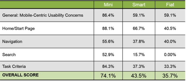
I recently conducted a mobile expert review of three auto manufacturer mobile websites (MiniUSA, SmartUSA, and Fiat) in order to assess their overall user experience and ease of use. I used a handful of usability metrics and assigned scores to each of them in order to determine which mobile site was the most user-friendly. Here are some of the top-level findings and results from my review.
Usability Metrics
- General: Mobile-Centric Usability Concerns – Is the site optimized for mobile?
- Home / Start Page – Are key tasks easy to locate on the home / start page?
- Navigation – Are there convenient and obvious ways to move between pages and sections and is it easy to return to the homepage?
- Search – Is it easy to locate the search box? Can you easily filter/refine search results?
- Task Criteria – Is the info on the site presented in a simple, natural and logical order?

Top-Level Findings
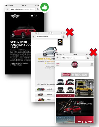
- Location of search icon was quick and intuitive on the MiniUSA site – Quick access to search is a must these days. The MiniUSA site was the clear winner in this respect, as SmartUSA and Fiat failed to provide a search feature on their homepage.

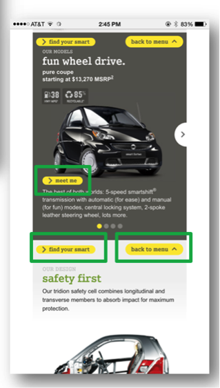
- Uncommon, small CTAs were problematic on the SmartUSA site – Several CTA’s, such as ‘meet me’, ‘back to menu’, and ‘find your smart’, on the SmartUSA site proved to be quite confusing, as it’s not clear where users would be taken if they clicked/tapped on these CTAs. Also, with very precise touch targets, the CTAs were very small and difficult to tap on.

- Homepage on the Fiat site provided minimal direction – It was not intuitive where to begin a search when looking to buy/lease an automobile. Additionally, while the burger menu was easy to see and access, it provided options far too vague for users to know where they needed to go subsequently to continue their search.

Now that I’ve shared a few examples from an expert review of my own, here are some tips for how to conduct an expert review of your own. While conducting an actual usability test of your mobile site is the ideal route, conducting a quick usability review is still a great start!
Tips for Conducting a Mobile Expert Review
- Identify the critical goals and tasks of your mobile site –It is imperative that you identify the primary goal(s) of your site so that you can know what usability issues are wreaking the most havoc on your bottom line. For example, if you are in the clothing business and you have seen a recent decline in online sales of t-shirts, a crippling usability issue may be present that is preventing users from completing the checkout process, hence the decline in sales. In the e-commerce world, shopping cart abandonment is an extremely widespread issue. Therefore, by conducting an expert review you’ll be able to uncover the specific error(s) occurring at major touch points within the checkout process that are impeding your customers from completing their purchase.
- Define your typical users via a customer persona –The majority of web, mobile sites, and applications have typical users who share a relatively familiar set of skills and expertise when it comes to critical tasks. It’s the job of your organization to identify a “Persona”, which is basically a fictional representation of your typical user or customer. Constructing and modifying your mobile site based on your specific customer personas will allow you to custom tailor site attributes such as terminology, information architecture, and navigation schema precisely to the customers that will be interacting with your site most often.
- Don’t just look at your site, go use it! –This is the part of the expert review where the hands-on review takes place. Since you’ve already identified the critical goals and tasks of your site, as well as your customer personas, now you can put yourself in the shoes of your customers and go through those critical tasks yourself. Take the previously identified critical tasks and walk through them one at a time as if you were the customer, all the way down to completing the t-shirt purchase (using the aforementioned clothing business example).
Now that you’re equipped with some tips for how to conduct a great usability expert review, you can grab your smartphone and put this recently acquired knowledge to work. Your managers, business owners, stakeholders, and most importantly your customers, will surely thank you!