by KLI | Sep 1, 2015 | mobile, Uncategorized, usability, UX
by Matt Bruce
In the technologically advanced and incredibly mobilized world we live in today, there’s constant pressure on organizations and businesses to provide customers with a great mobile user experience. According to Google’s Consumer Barometer and the Connected Consumer Survey (2014 / 2015), 57% of the population currently uses a smartphone. Moreover, smartphones play an integral role throughout various phases of product research. Simply put, people are using their smartphones to read about your business and your products, making it imperative that your mobile site be very user-friendly.


Source: Consumer Barometer with Google – The Connected Consumer Survey 2014 / 2015
So, how do businesses ensure that the mobile experience they’re providing their customers with is a great one? Well, that’s a great question, and a great start to answering that question would be to conduct a mobile usability expert review.
At its core, a usability expert review is an actual usability inspection of your site conducted by a usability specialist in order to identify potential usability issues. A usability expert review is one of the most in-demand, cost-effective usability techniques. Expert reviews are a great way to identify glaring usability blunders. They are quick, inexpensive, and provide an immediate sanity check in regards to your user experience.
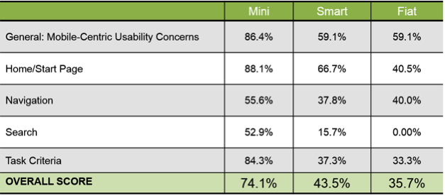
I recently conducted a mobile expert review of three auto manufacturer mobile websites (MiniUSA, SmartUSA, and Fiat) in order to assess their overall user experience and ease of use. I used a handful of usability metrics and assigned scores to each of them in order to determine which mobile site was the most user-friendly. Here are some of the top-level findings and results from my review.
Usability Metrics
- General: Mobile-Centric Usability Concerns – Is the site optimized for mobile?
- Home / Start Page – Are key tasks easy to locate on the home / start page?
- Navigation – Are there convenient and obvious ways to move between pages and sections and is it easy to return to the homepage?
- Search – Is it easy to locate the search box? Can you easily filter/refine search results?
- Task Criteria – Is the info on the site presented in a simple, natural and logical order?

Top-Level Findings
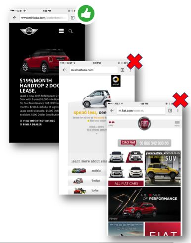
- Location of search icon was quick and intuitive on the MiniUSA site – Quick access to search is a must these days. The MiniUSA site was the clear winner in this respect, as SmartUSA and Fiat failed to provide a search feature on their homepage.

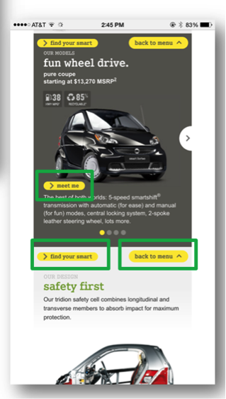
- Uncommon, small CTAs were problematic on the SmartUSA site – Several CTA’s, such as ‘meet me’, ‘back to menu’, and ‘find your smart’, on the SmartUSA site proved to be quite confusing, as it’s not clear where users would be taken if they clicked/tapped on these CTAs. Also, with very precise touch targets, the CTAs were very small and difficult to tap on.

- Homepage on the Fiat site provided minimal direction – It was not intuitive where to begin a search when looking to buy/lease an automobile. Additionally, while the burger menu was easy to see and access, it provided options far too vague for users to know where they needed to go subsequently to continue their search.

Now that I’ve shared a few examples from an expert review of my own, here are some tips for how to conduct an expert review of your own. While conducting an actual usability test of your mobile site is the ideal route, conducting a quick usability review is still a great start!
Tips for Conducting a Mobile Expert Review
- Identify the critical goals and tasks of your mobile site –It is imperative that you identify the primary goal(s) of your site so that you can know what usability issues are wreaking the most havoc on your bottom line. For example, if you are in the clothing business and you have seen a recent decline in online sales of t-shirts, a crippling usability issue may be present that is preventing users from completing the checkout process, hence the decline in sales. In the e-commerce world, shopping cart abandonment is an extremely widespread issue. Therefore, by conducting an expert review you’ll be able to uncover the specific error(s) occurring at major touch points within the checkout process that are impeding your customers from completing their purchase.
- Define your typical users via a customer persona –The majority of web, mobile sites, and applications have typical users who share a relatively familiar set of skills and expertise when it comes to critical tasks. It’s the job of your organization to identify a “Persona”, which is basically a fictional representation of your typical user or customer. Constructing and modifying your mobile site based on your specific customer personas will allow you to custom tailor site attributes such as terminology, information architecture, and navigation schema precisely to the customers that will be interacting with your site most often.
- Don’t just look at your site, go use it! –This is the part of the expert review where the hands-on review takes place. Since you’ve already identified the critical goals and tasks of your site, as well as your customer personas, now you can put yourself in the shoes of your customers and go through those critical tasks yourself. Take the previously identified critical tasks and walk through them one at a time as if you were the customer, all the way down to completing the t-shirt purchase (using the aforementioned clothing business example).
Now that you’re equipped with some tips for how to conduct a great usability expert review, you can grab your smartphone and put this recently acquired knowledge to work. Your managers, business owners, stakeholders, and most importantly your customers, will surely thank you!
by KLI | Jul 8, 2015 | KLUE, mobile, Strategy, UX

by Troy Abel
Looking for a cutting-edge, quick and easy way to get your designs from concept to interactive prototype? Working in an agile design environment and need insight into the usability of your concept prior to wireframing? If you answered yes to either of these questions, the POP (Prototyping on Paper) is a design methodology and app you’ll want to check out.
Paper prototypes are not a new or novel concept to the IxD Designer; however, adding interactivity to these paper prototypes is rather new. Enter an amazing app POP. I discovered POP when I was designing a niche market yellow pages app for iOS with a fellow designer at a design bootcamp. We needed a quick, down and dirty way, to test the interactions of our interface. We wanted to validate our design decisions quickly prior to designing the wireframes. A fellow student introduced us to POP.
Using POP is simple. You download the app on your iOS, Android, or Windows mobile phone and start snapping photos of your drawing comps. You can then either work on a desktop/laptop or directly on your mobile phone adding ‘hotspots’ by drawing and dragging active areas and defining what action those hotspots should execute. Link pages together by assigning actions to these hotspots and build a functioning paper prototype of your app in minutes.
Take your concept one step further by using the built-in sharing function of POP. We decided to do some guerilla testing of our initial navigation structure and used the sharing function of POP to share our prototype with friends. We also used Key Lime’s mobile testing tool KLUE to record the interactions and video of the user while interacting with our product. These initial findings helped us tweak our design prior to building and testing wireframes.
Another great feature of POP is the ability to sync with Dropbox and integrate easily into your workflow. Drop photos of your pencil sketches into Dropbox and they immediately appear in POP’s app. Have photos from others working on the same app, share your Dropbox folder and have everyone drop their photos into Dropbox for immediate access to screens from all your team members.
POP is a great app for anyone who needs to quickly gain insight into their designs- heck they even have free downloadable sketch templates for all kinds of mobile devices! Have questions about prototyping on paper, or UX & IxD design in general? Reach out to me- troy@keylimeinteractive.com (UX Research Manager at Key Lime Interactive).
by KLI | Feb 10, 2015 | e-commerce platforms, ipad, iPhone, mobile, usability, UX
by Kathleen Henning
While interviewing participants about online shopping habits, regardless of the product, the same issues appear:
- I don’t know if it’s true to size
- Will this fit?
- Is this item good quality?
- Will it be as pictured?
- What is it made of?
These are the questions that determine whether or not they will make a purchase. Many customers, if they do not get satisfactory answers to these questions, will choose to either locate the item in stores or simply purchase something else from a competitor.
When customers are researching products online, they’re trying to understand what the product would look like in person. There are a variety of ways they currently expect companies to help them do this, but their main research method is customer reviews. They’re looking for information about the quality, the fit, the size, the accuracy of the photos, etc. They’re also looking to see if the reviewer is someone like them. In our research, we’ve found that some users really value a reviewer profile with some demographic details (i.e. age, location, style, size, etc.). Users also appreciate retailer efforts to aggregate some of this information, like the size charts Nordstrom and Amazon use.
Recently, retailers have started providing customers with some of this information on their own, like the features and fit. The most critical element of any website trying to sell tangible products is a good zoom feature. If someone is looking to buy clothes, shoes, or furniture, they want to get an up close view. They may want to buy it online, but they’re looking for the feeling of seeing it in person. The more they can see of the item, the more likely they will be to purchase it online. Some websites, like Saks Fifth Avenue and West Elm, have videos of the products available for purchase that show the product ‘in motion’. Customers find this to be very helpful.
When trying to better understand fit, customers are looking to retailers for support. Some users have mentioned that they find it helpful when the site tells them the height of the model and the size he / she is wearing. Others use services like Fit Predictor, available at Saks Fifth Avenue and other department stores. This uses your size in brands you have purchased to determine your size in other brands and different items. The FitPredictor predicts the right size for you based on what size you wear for other brands. For example, if you wear a size 8 jean from The Gap, then the FitPredictor will predict the correct size jean in the brand you’re shopping.
Companies should think about the fundamental product questions their users have when determining which features to include on the product page. Will these features help users make a purchase decision by addressing common issues such as quality, fit, size, color, etc.? While much of the initial decision about an item is visual and focused on whether it fits a shoppers personal style, the final decision is based on whether customers believe they have a full understanding of how that item will fit into their lives.
by KLI | Nov 12, 2014 | Conferences, Cultural Impact, Humor, iPhone, mobile, usability, UX
by Kelly Nercess
Lets face it. We live in a society where the majority of people are glued to their mobile devices. Whether it’s texting a friend, finding an online recipe for dinner, or taking a selfie…everyone, at one point or another, is guilty of being attached to their smartphone.
During the Big Design conference in Dallas this year, I had a chance to attend Pamela Pavliscak’s workshop on “ The Real Mobile Experience”. Aside from her entertaining jokes and quick wit, she gave us a her insights on what people really do on mobile phones and how to design for those activities.
Some quick facts:
– For every baby born, there are five mobile devices activated
– 7 billion mobile phones in the world. 55% of those are smartphones
– Typical mobile users check their phones 150 times a day
– Smartphone owners spend over 2 hours on their phone each day
– 21% of US mobile phone owners go online primarily using their phones and globally that number is even higher
– Out of preference: 50% of smartphone owners under 30 use the Internet primarily on their mobile phone
– Out of necessity: 55% of Americans who make less than $30k/year have no web access at home
– For convenience: 34% use the device simply because it is close at hand
– 29% say that their phone is the first and last thing that they look at everyday
– 44% sleep with their phones (in a very platonic manner)
Based on the data that Pavliscak reported, people show a remarkable dependency on their smartphones. The fact that we now wake up and go sleep with this electronic device by our side can even be intimidating for a spouse. Women were asked if they would rather give up sex or their mobile phone for 1 month. Can you guess the answer? 48% of women said they would rather give up sex, while the other 52% said they would rather do without their mobile phones. Hmm, interesting. Where do you fall on the spectrum?
An experiment was performed where she asked 250 people to “take a look at their phone”. She was requesting the owner to just happily pass their phone over to a perfect stranger. The result:
– A slim amount of people actually handed over their phone
– Some made an excuse not to pass it over
– Some also just instantly put their phone away
– Majority of people would hold the phone out and show it while it was still in their possession
So, what does this mean for society? We are way too overprotective of our phones. It’s as if it was our newborn child.
In addition to our phones providing a channel for enhanced social interactions, they also allow us to also solve problems. Pavliscak reported that 86% of people solve problems with their phones, which includes troubleshooting emergencies. What else do we use our devices for? High on the list is making sure our kids are happy. Only 20% of parents don’t use tablets or phones to keep their children occupied. So next time you are at a restaurant and you see a young child playing Angry Birds as opposed to eating their macaroni and cheese, you can look at them and think “Oh, you’re part of that 80%”.
We all know that we love and adore our phones, but what are we really doing on them? Ms. Pavliska proposed another experiment to research what we are spending our time on when our eyes are glued to that mobile screen. Even though we look at it over 150 times a day, we’re usually using it in three ways:
– 72% of the time we Tap
– 77% of the time we Swipe
– 94% of the time we are Scrolling
People know how to use the zoom button, but surprisingly a lot of us will continue to read the small text as opposed to using the gesture to make it larger. How can we optimize the mobile experience based on this data?
– Take the guesswork out for the user, but give them obvious cues
– Get rid of any needless gestures
– First impressions hold the most value for The Flick (scroll down to the bottom, and then quickly back up to the top)
– Don’t have to many hidden menus for when a user applies the The Washing Machine method (someone who swipes up and down/right and left)
– We go to great lengths to avoid typing, so consider that when designing your mobile site
– Use icons in a way that is consistent with other sites
– Essential content should be on the page or on the top (hamburger menus are iffy)
– Sound cues are a missed opportunity – only 74% of people leave their ringer on
Overall, there is much room for improvement for the user experience of mobile devices. They are attached to their phones almost as if it were another limb. Aside from the great content she was able to share, she had an upbeat and entertaining presentation style that did not go unnoticed by the crowd. If I get the chance to attend another talk by Pamela, I won’t miss the opportunity!
by KLI | May 5, 2014 | airline, Competitive Index, mobile
by Phil McGuinness
At Key Lime Interactive, we’ve provided competitive research analysis in the Auto Insurance and Banking Industry mobile app offerings for years. Now, on the heels of TripAdvisor reporting a milestone of 100 million iPhone and Android app downloads, we decided to take a quick peek at four top travel booking apps to see how they compare. We selected four brands and evaluated the Android app flight finding and booking process to find out which have the best usability, ranking them not only on number of features, but execution.
Our Methodology
The apps were awarded points or scored based on two criteria
- The total number of available capabilities to users
- The successful execution of each
In review, each app was credited for an integrated capability, such as sorting, filtering, alerts, or the ability to save flight information. After this we looked at the execution of each feature to provide more nuance to the rankings, such as the number of sorting/filtering options provided or the flexibility of alert settings for apps that had flight alerts. The final positioning of each app in our ranking is based on a combination of those two measurements.
NUMBER 4: Expedia
Expedia is far and above the best looking app of the this group, from the landing screen that scrolls hotel and flight destinations via colorful pictures, to the search results loading screen that mimics the view out your airplane window. The app is also extremely quick and responsive, allowing both departing and return flights to be selected without any extended load time. However, there is not much that stands out in this app beyond those features. The flight search has only a few basic options. The results page and booking engine are relatively sparse, with only four sorting options available for results. Although the aesthetics are exceptional, the lack of functionality in Expedia’s app results in a lower ranking in comparison to the other apps we reviewed.
NUMBER 3: Priceline
Priceline, which acquired Kayak in June 2013, ranked just ahead of Expedia in the find flight and booking analysis. The app has a strong branding message. William Shatner and Kaley Cuoco are available in the lower left hand corner to chauffeur you through a flight search. During the search process, Priceline saves recent airport searches in a list, which rewards the user for repeated uses of the app. The results page also provides six different sorting options, from Number of Stops to Airline, which is great for users who want to avoid specific airlines or too many layovers. While the remainder of the experience is solid, Priceline lacks to the bells and whistles of some of the apps in this competitor set.
NUMBER 2: TripAdvisor
TripAdvisor’s strengths are apparent from the minute you land on the results page, where sorting and filtering options are available. This allows users to select time of day for departure or arrival, the number of stops, or to view specific airlines. Additionally, users can request alerts for flight prices from within the app, and the bottom bar links to comparison rates from other providers making it easier for bargain hunters to find the best price. Finally, users who want to save their information for later can e-mail their itinerary after selecting flights – a very convenient feature for frequent travelers who need to keep their itinerary close at hand.
AND THE WINNER IS… Kayak
Kayak’s no-frills interface belies a wealth of functionality, and ranks first primarily due to stronger execution of features that can be found in the TripAdvisor app. Kayak has the most robust sorting and filtering menus available, as well as extensive options for setting alerts. The app is also the only one we evaluated that allowed multi-city flight searches. Anyone thinking of hopping around Europe this summer will appreciate this feature. During the flight search, the Kayak app allows users to add any nearby airports to their search, truly a plus when traveling to or from areas with multiple airports that may have better fares. The quality of Kayak’s many features make it best in class for flight finding and booking.
We hope you found this ranking helpful. Key Lime Interactive offers expanded custom competitive research. If you’d like more information, please contact KLI here.